
How Figma Uses 3 Collaboration UX Patterns to Drive Product Adoption

For years, digital design was treated as a largely solo activity. A designer worked in a desktop application, saved a local file, exported screenshots, and sent them to teammates for review. Feedback arrived through email, chat, or meetings, while developers often worked from specifications that became outdated as soon as the design changed.
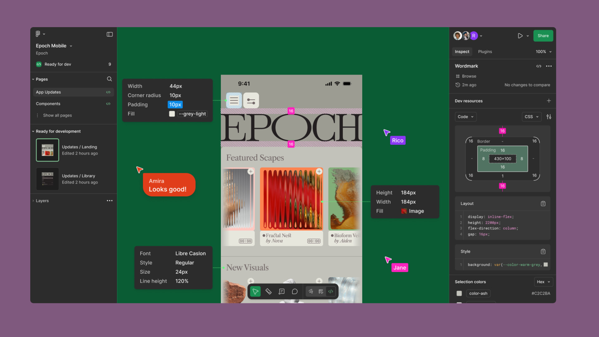
Figma changed that model by making the design file a shared online workspace. Instead of treating collaboration as an additional feature, the company made multiplayer participation central to the product experience. Designers, product managers, developers, writers, and clients could enter the same file, view the same work, and contribute without relying on endless attachments and exports.
This article examines three Figma UX patterns that helped turn collaboration into a product adoption engine: real-time multiplayer editing, comments placed directly on designs, and effortless link sharing. It also explains why these patterns work and how product teams can apply them to improve adoption across an organization.
Table of Contents
The Collaboration Problem Figma Had to Solve
Traditional design workflows created several layers of friction. Locally stored files made version control difficult. Specialized software created barriers for non-designers. Reviews depended on presentations, exported PDFs, or long message threads. When stakeholders responded, designers had to reconnect scattered comments with the correct screen, component, or interaction.
This was not only a productivity problem. It was an adoption problem.
A design tool could be powerful for its primary user while remaining inconvenient to everyone else involved in shipping a product. When participation requires software installation, large downloads, technical training, or repeated handoffs, fewer people engage with the tool.
Figma approached the problem differently. Its original launch positioned it as a collaborative interface design tool, while its multiplayer technology supported live editing inside a shared file. Figma now reports that 95% of Fortune 500 companies use its platform, based on March 2025 data. That reach demonstrates the value of making collaboration easy enough to spread beyond the design department.
1. Real-Time Multiplayer Editing Makes the Product Social
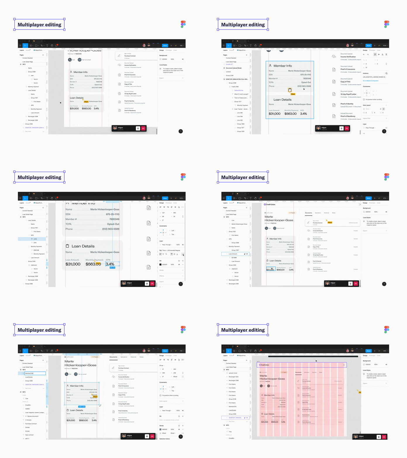
The most visible Figma UX pattern is real-time multiplayer editing. Multiple people can open the same file, see one another’s cursors, follow activity, and watch changes appear as they happen.
Figma’s help center states that a file can include up to 500 collaborators, with as many as 200 people editing simultaneously. This capacity allows entire product teams to participate in the same workspace rather than passing files from one department to another.
The experience feels closer to working around a shared table. A designer can adjust a layout while a writer improves the copy. A product manager can clarify requirements while an engineer inspects the proposed behavior. A remote design critique can happen inside the work instead of around a screen share.
Multiplayer editing also creates a natural invitation loop. One user brings another person into the file to review a decision. That person experiences Figma without needing to begin as a dedicated designer. Over time, Figma becomes the place where the team discusses and understands the product, not simply where visual assets are created.
RAW.Studio describes a similar benefit in its article on managing a remote process across five time zones. The studio identifies Figma’s live collaboration capabilities as part of a remote-friendly toolset that keeps distributed work moving efficiently.
2. Contextual Comments Keep Feedback Attached to the Work
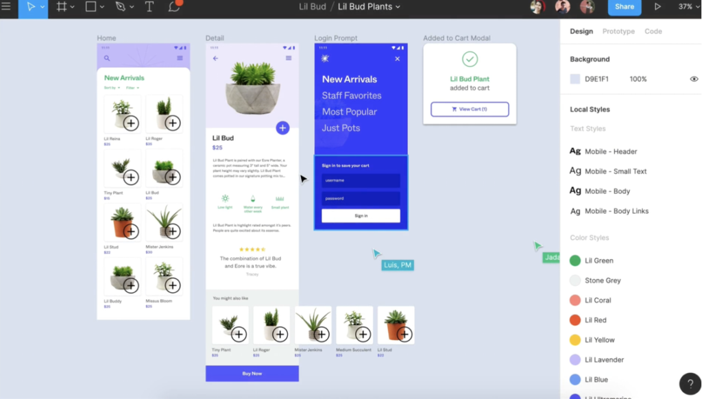
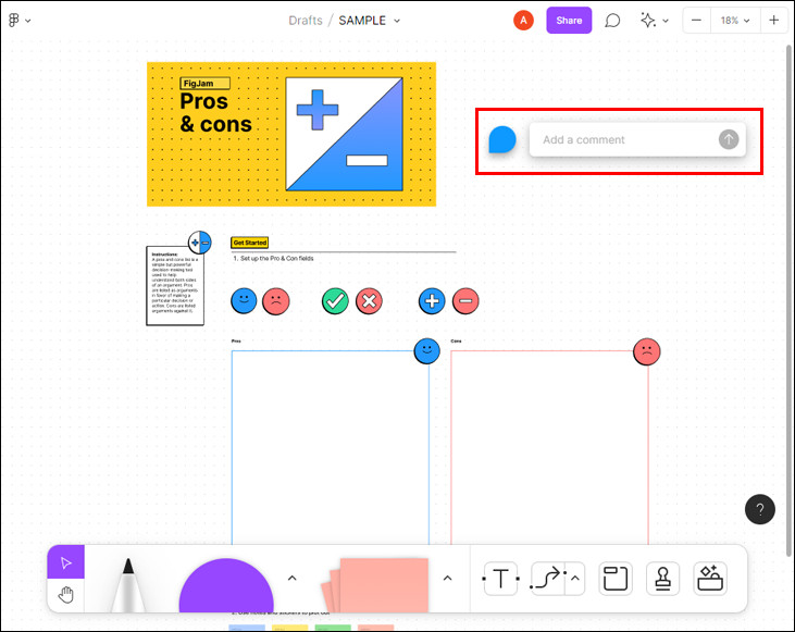
The second Figma UX pattern is direct commenting. Instead of sending feedback through a separate email or message, a reviewer can place a comment on the exact design element being discussed. Replies remain connected to that location, while resolved comments indicate that an issue has been addressed.
Context improves the quality of feedback. A message such as “Can we make this clearer?” is ambiguous in a long email thread. When it is pinned to a specific button, form field, or headline, its meaning becomes immediately understandable.
The designer spends less time locating the issue, while the reviewer does not need to describe where it appears. Conversations also remain accessible to other collaborators who may need to understand why a decision was made.
Commenting makes participation easier for people who do not edit designs. Product managers, clients, researchers, marketers, and executives can contribute without learning the full interface or risking accidental changes. Figma also allows people on paid plans to view and comment on files without requiring additional paid seats, lowering the barrier to stakeholder participation.
This principle supports the collaborative future discussed in RAW.Studio’s article on Figma AI and modern design workflows. The article explains how better organization, automated processes, and consistent file structures can improve collaboration between designers and developers.
3. Easy Link Sharing Turns Every File Into an Entry Point
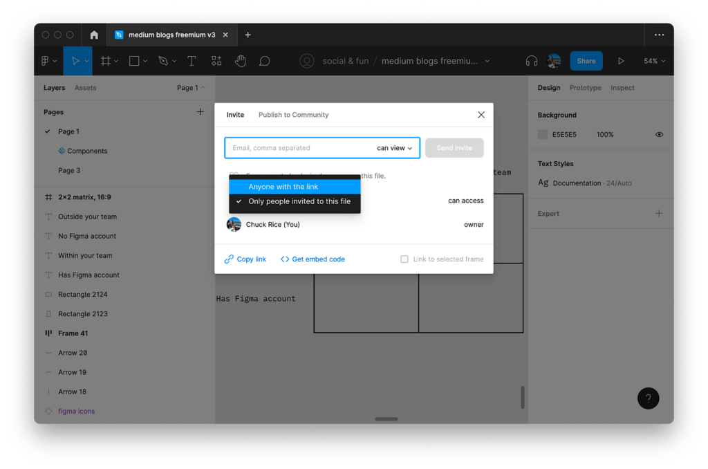
The third pattern is simple link sharing. A Figma file or prototype can be shared through a URL, with permissions determining whether the recipient can view, comment, or edit.
This solved a persistent problem in design workflows. Access no longer depended on sending the latest file, exporting another presentation, or asking recipients to install specialized software.
A link is a lightweight invitation. It can be pasted into a project ticket, sent in a team chat, added to documentation, or opened during a meeting. The recipient arrives at the current version rather than an outdated attachment.
Easy sharing also supports product-led growth. Every shared file exposes another collaborator to Figma’s interface and value. A recipient may begin as a viewer, become a commenter, and eventually create or edit files. Adoption expands through normal teamwork rather than depending entirely on a top-down software rollout.
Why These Figma UX Patterns Work
These patterns work because collaboration is not separated from the main product experience. Editing, discussing, reviewing, and sharing all happen around the same source of truth.
The product also becomes more valuable as additional people join. This gives active users a reason to invite teammates, creating a network effect within each organization.
The need for better collaboration is measurable. Figma reports that 84% of designers collaborate with developers at least weekly. However, 91% of developers and 92% of designers believe the handoff process could be improved. A product that reduces the distance between design and development addresses a frequent source of frustration.
Three Ways to Apply the Figma UX Approach
First, make sharing effortless. Give users a fast and understandable way to invite another person into the relevant project, document, or workflow. Keep permission choices clear and make the shared destination useful to a first-time visitor.
Second, reduce handoff friction. Feedback, decisions, files, and implementation details should remain connected whenever possible. Contextual comments, version history, status updates, and role-specific views can prevent work from losing meaning as it moves between departments.
Third, design around team workflows rather than isolated tasks. Map who creates the work, who reviews it, who approves it, and who implements it. Then remove unnecessary transitions between those roles.
RAW.Studio’s article on data analytics in design reinforces this broader principle. Product decisions improve when information and design work together instead of remaining in separate organizational silos.
Conclusion
Figma did more than move design software into the browser. It redesigned the social experience surrounding digital product creation.
Real-time editing made teamwork visible. Contextual comments made feedback actionable. Link sharing made every file an invitation into the product.
The broader Figma UX lesson is that collaboration can become a growth mechanism. When users naturally bring teammates into a product to complete real work, adoption becomes part of the workflow. The strongest collaboration features do not merely help existing users work faster. They give new users an immediate reason to participate.
If your product depends on teams but still feels designed for isolated users, request a UX strategy proposal from RAW.Studio. Stronger collaboration patterns, clearer workflows, and smoother handoffs can turn everyday teamwork into a reliable product adoption engine.
Get a UX & CRO Expert’s Eyes on Your Website. Book a free 30-minute UX Teardown and get actionable insights on what’s costing you conversions — no fluff, just fixes you can implement right away.
Book a Free UX Audit

Related posts
How Amazon Uses 5 UX Principles to Achieve 10–15% Conversion Rates
Most e-commerce businesses operate within a narrow band of performance. Industry-wide, conversion rates typically hover between 2% and 3%. That […]
Why the Traditional UX Process Holds Designers Back
If you’ve ever searched for “UX design process,” you’ve likely encountered the same tidy diagrams repeated across blogs, textbooks, and […]

Prototyping: A Startup Founder’s Secret to Success
We’ve had so many grass-root startups come up to us with an extraordinary product idea but don’t know where to […]
Creative product design that gets results
Take your company to the next level with world class user experience and interface design.
get a free strategy session
