
Customer Journey Mapping That Actually Drives Decisions

Most companies have a customer journey map somewhere.
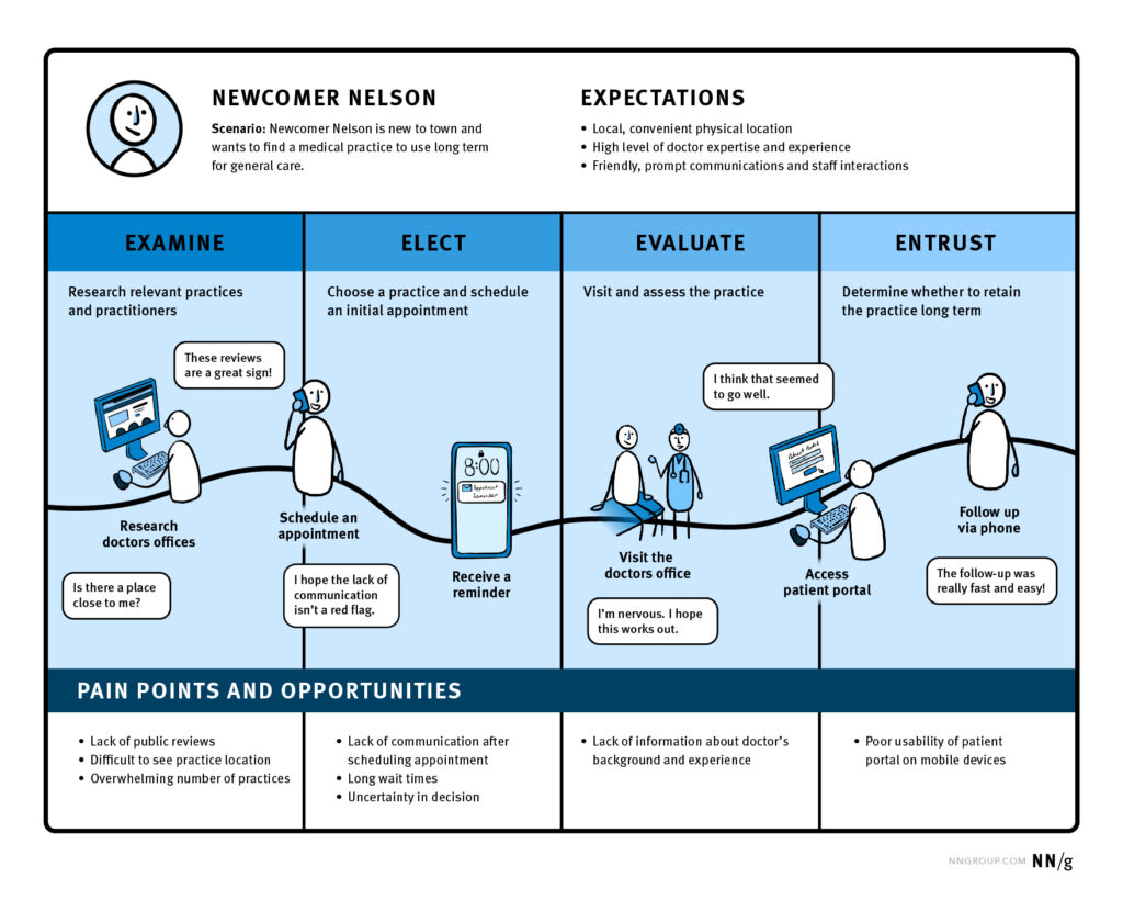
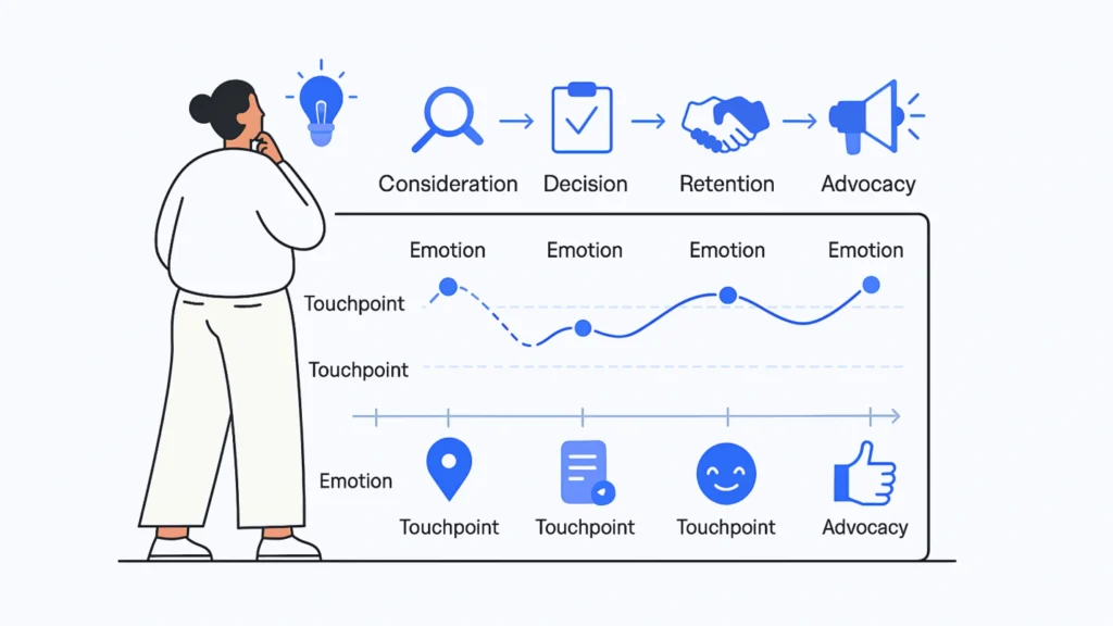
Maybe it was created during a workshop eighteen months ago. It probably has a persona at the top, a series of stages across the page and an emotional curve running from happy to frustrated and back again.
Then the workshop ended.
The map was exported to PDF, dropped into a shared drive and slowly forgotten.
There is nothing inherently wrong with journey mapping. The problem is that too many journey maps are built as workshop outputs rather than tools for making decisions.
A useful customer journey map should help your team understand where real customers struggle, why those moments matter and what should happen next. It should connect what users experience with evidence from interviews, analytics, support conversations and observed behaviour. Most importantly, it should give the team something concrete to act on.
That is the difference between a map that gets admired once and one that actually earns its place in the product process.
This guide looks at how to create the second kind.
Table of Contents
Why So Many Customer Journey Maps Go Nowhere
Journey maps usually lose their value for one of three reasons: they are based on assumptions, they try to cover far too much, or they stop at identifying problems.
The first is probably the most damaging.
A team gets into a room and starts filling in what it believes customers are thinking:
“They’re probably excited here.”
“This part might be confusing.”
“They probably want more information at this point.”
Soon enough, the map looks convincing. There are sticky notes everywhere, the emotional curve makes sense and everyone can recognise parts of the experience.
But recognition is not the same thing as evidence.
Internal teams are naturally biased by familiarity with their own product. Things that feel obvious to somebody who has spent two years working on a platform can be completely unclear to someone using it for the first time.
A good journey map gives the customer’s reality more weight than the team’s assumptions.
This is why journey mapping works best as part of a research process rather than as an isolated workshop exercise.
What a Useful Customer Journey Map Actually Contains
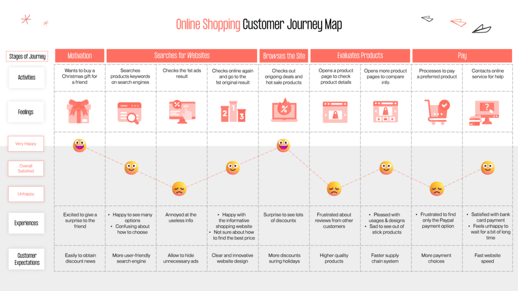
At its simplest, a customer journey map tells the story of someone trying to achieve something over time.
The important word there is someone.
A useful map should describe a recognisable user in a specific situation. “The customer” is usually too vague. “An operations manager at a growing company comparing our platform with their current spreadsheet-based process” gives you far more to work with.
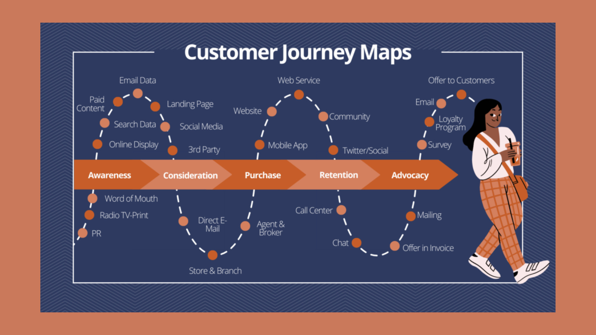
From there, the journey is divided into the stages that person actually goes through. Those stages might include discovery, evaluation, sign-up, onboarding and ongoing use, but there is no universal structure. Your customer may experience the product differently from the neat funnel your business uses internally.
For each stage, you want to understand what the user is trying to achieve, what they actually do and where those interactions happen.
You also want to know what is going through their head.
What are they unsure about? What reassures them? What makes them hesitate? At what point does confidence start to drop?
This is where direct research becomes particularly valuable. A sentence pulled from a real interview or support ticket carries much more weight than a sticky note saying “user feels frustrated.”
The final piece is connecting those moments to actual opportunities.
If someone repeatedly struggles to understand your pricing, the journey map should not simply record “pricing confusion.” It should help the team understand what is causing the confusion, what evidence supports the finding and what could realistically change.
That bridge between friction and action is what turns journey mapping from documentation into a decision-making tool.
Ground the Journey in Research, Not Guesswork
The quality of a journey map depends heavily on where its information comes from.
Workshops are useful. They bring people together, expose differences in understanding and make it easier to see the whole experience in one place. But workshops should organise what you know. They should not manufacture customer insight.
User interviews are one of the strongest starting points.
Instead of asking someone what they would do in an imaginary situation, ask them to walk you through something that actually happened. Where did they begin? What were they trying to achieve? What did they expect to happen next? Where did they hesitate? What nearly made them give up?
Those details are often where the useful insight lives.
If you are planning interviews specifically for journey mapping, our guide to conducting better user interviews goes deeper into how we structure conversations around actual behaviour instead of hypothetical answers.
Interviews are only one part of the picture, though.
Analytics can tell you where people leave a funnel or fail to complete a step. Session recordings can show repeated clicks, hesitation and unexpected navigation patterns. Support tickets reveal the questions customers keep asking in their own words. Sales calls can uncover objections that never appear in your product analytics.
The strongest maps bring several of those sources together.
Instead of saying:
“We think people find checkout confusing.”
You might be able to say:
“A significant group is dropping at the delivery step, several interview participants questioned the delivery estimate, and the same concern keeps appearing in support conversations.”
Now you have something the team can investigate.
That combination of qualitative and quantitative evidence is also central to using data to inform UX decisions. Numbers can show you where something is happening; research helps you understand why.
How to Build a Customer Journey Map
Start by deciding exactly what you want to understand.
Trying to map “the entire customer experience” sounds ambitious, but it often produces something too broad to be useful. There are simply too many users, channels, goals and edge cases competing for attention.
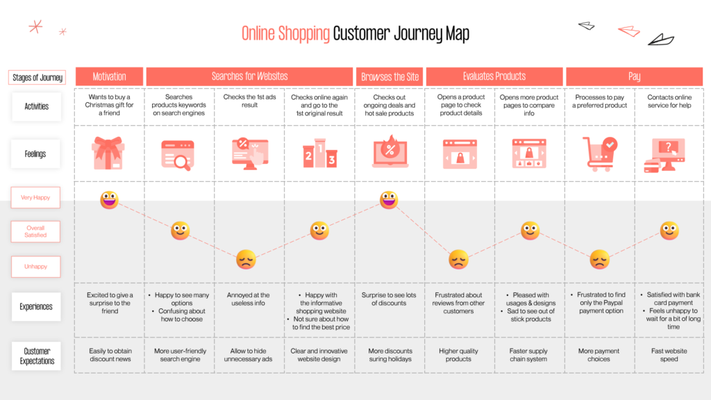
A tighter question works better.
You might map how a first-time SaaS customer moves from starting a trial to reaching their first useful outcome. An ecommerce team might focus entirely on the journey from product page to completed checkout. Another company may want to understand why customers reach the cancellation screen in the first place.
Once the scope is clear, gather the evidence around that experience.
Run interviews. Pull the relevant analytics. Review support conversations. Look at session recordings if you have them. Talk to the people in your organisation who regularly hear directly from customers.
Then start laying out what actually happens.
Do not worry initially about making the map beautiful.
Look for the natural stages customers move through and document what they are trying to accomplish in each one. Capture their actions and the touchpoints involved. Add thoughts, questions and emotional changes where you have evidence for them.
A customer checking your pricing page might be asking whether the product will scale with their team. During sign-up, that concern might change to whether they are committing to something they cannot easily cancel. During onboarding, they may simply be wondering what they are supposed to do first.
Those are very different problems, even though they belong to the same overall journey.
Once the journey is visible, mark the moments where evidence suggests something is going wrong.
The key word is evidence.
If you cannot connect a pain point to an interview, analytics pattern, customer conversation, usability observation or another credible source, treat it as a hypothesis rather than a finding.
That small distinction makes the final map much easier to trust.
Do You Need an End-to-End Map?
Sometimes.
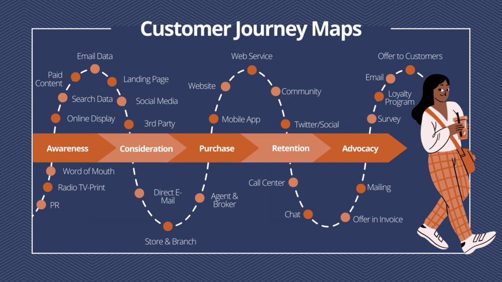
An end-to-end customer journey can be useful when leadership needs to understand the wider experience across marketing, sales, product, support and retention.
It gives everyone a common picture.
But broad maps come with a trade-off: the more of the journey you include, the less detail you can usually capture at each stage.
If the immediate problem is onboarding completion, mapping everything from the first ad impression through to annual renewal probably will not help you fix onboarding any faster.
Map onboarding.
Go deep enough to understand the moments where people hesitate, abandon setup or fail to reach value. Once those problems are understood and improved, you can expand the scope.
Raw Studio’s guide to UX onboarding explores many of the smaller experience decisions that influence whether new customers keep moving or leave before understanding the product.
A narrow map that changes something is more useful than an enormous map that explains everything and fixes nothing.
Turn Pain Points Into Decisions
This is where many otherwise good journey maps fall apart.
The team has done the research. The map is full of useful observations. Everyone agrees that the experience has problems.
Then nothing happens.
The map itself should not be considered the final deliverable.
Its real output is a set of decisions.
For every meaningful pain point, ask what evidence supports it, what effect it appears to have, what could improve it and who needs to take the next step.
Suppose research shows that trial users repeatedly abandon onboarding before inviting their team.
You might initially think the answer is to redesign the invitation screen.
But deeper research may show something else: users do not yet understand why inviting teammates matters. The problem is not interaction design. It is that the product is asking for commitment before demonstrating enough value.
That distinction matters.
A journey map should create enough context to stop teams jumping straight from “there is friction here” to “redesign this screen.”
Sometimes the answer is content. Sometimes it is product logic. Sometimes it is timing, support, pricing, technical performance or a process completely outside the interface.
This is also where the findings from a journey map can feed naturally into a broader UX audit, particularly when the team needs to compare several friction points and decide which problems deserve attention first.
Once actions are agreed, put them somewhere people already work.
A journey-map PDF buried inside a research folder will not change the product. A prioritised issue in the team’s roadmap with an owner and a clear next step has a much better chance.
Journey Map vs Service Blueprint: Know When to Go Deeper
Journey maps are deliberately customer-facing.
They show what someone experiences as they move through a product or service.
That makes them excellent for finding where an experience is breaking down.
But sometimes you need to understand why.
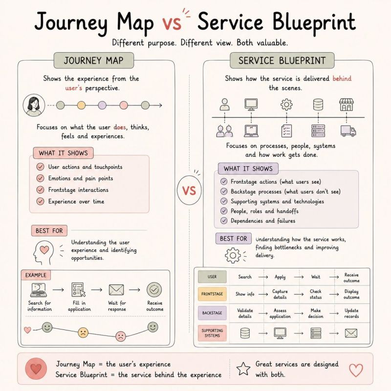
Imagine customers consistently complain that refunds take too long. A journey map can show the waiting period and the frustration it causes. It may also tell you which messages or touchpoints make the situation worse.
What it does not necessarily show is everything happening behind the scenes.
Maybe support has to send each refund to finance manually. Perhaps finance only processes requests twice a week. Maybe the payment platform adds another delay after approval.
That is when the conversation begins moving into service design.
Service design looks beyond the customer’s visible journey and considers the people, systems and processes required to deliver it. Our article on what service design is and how it benefits a business is a useful next read if your journey map keeps uncovering problems that appear to originate behind the interface.
The two tools are not competitors.
A journey map helps you understand the experience. A deeper service view helps you understand what has to happen internally to deliver that experience properly.
Keep the Map Alive
A customer journey map has a shelf life.
Products change. Pricing changes. Onboarding gets redesigned. Customer expectations shift. New support problems appear while old ones disappear.
A map created two years ago may still look impressive while describing a version of the business that no longer exists.
That does not mean you need to rebuild everything every month.
It does mean the map should be revisited when the experience changes significantly or when new research challenges what you thought you understood.
If analytics suddenly show a new drop-off, add it to the conversation. If support starts hearing a new complaint repeatedly, investigate it. If a redesign removes one source of friction, update the map instead of leaving an outdated problem sitting there forever.
The best journey maps are working documents.
They become a shared reference point between product, design, research, marketing, support and leadership rather than a snapshot owned by one team.
The Real Value Is Usually in the Worst Moments
A customer journey map does not need to capture every thought, tap, email and interaction your customer will ever have.
It needs to help you find the moments that matter.
The point where someone loses confidence.
The question they cannot answer.
The step where they abandon the flow.
The promise your marketing makes that the product does not quite deliver.
The support problem customers keep encountering.
Those moments are where journey mapping becomes commercially useful.
Improve the worst part of checkout and conversion can move. Remove the biggest source of uncertainty during onboarding and more customers may reach value. Fix a recurring service problem and you can reduce both frustration for customers and workload for the team supporting them.
That is where a journey map earns its keep.
Not as a polished poster.
As a clearer way to decide what deserves fixing next.
At Raw Studio, our research process is built around the same principle: understand what people are actually doing, combine that with behavioural evidence and turn the findings into priorities a team can own.
If your current customer journey map is gathering dust, the answer probably is not to make a prettier one.
It is to make the next one harder to ignore.
Get a UX & CRO Expert’s Eyes on Your Website. Book a free 30-minute UX Teardown and get actionable insights on what’s costing you conversions — no fluff, just fixes you can implement right away.
Book a Free UX Audit

Related posts

Personalized Shopping Experiences With Behavior UX
Personalization has moved from being a nice touch to becoming a core expectation in ecommerce. Shoppers want faster paths to […]

How LinkedIn Converts B2B Traffic with 3 High-Trust UX Strategies
LinkedIn UX has become one of the strongest examples of how intentional design can transform professional traffic into high-quality B2B […]
Why Menus Are Disappearing in Modern UX
Have you ever opened a new app or website and thought, “Wait… where’s the menu?” You’re not alone. Many users […]
Creative product design that gets results
Take your company to the next level with world class user experience and interface design.
get a free strategy session
