
10 Design Commandments You Must Consider for Your Product
Hey game changer,
It’s Philippe from Raw.Studio, hope you had a stellar weekend!
Today I’m on a mission to help kick start your week with some juicy, high-converting insights. I’ll be walking you through 10 key design considerations we integrate into every product we help shape and launch at our studio.
I know you’re busy..
So let’s get right into the details..
Table of Contents
Use Colour Responsibly (Coronavirus COVID-19 Global Cases)

The colours that you choose impact the user’s experience with your product.
Colors have a huge (but largely subconscious) influence on user behavior. It’s no surprise that McDonald’s uses red and yellow as its brand colors. When referring to food, these colors signal appetite, hunger, and joy. These are the positive emotions that come from the color red.
However, in a different context, when referring to a worldwide pandemic (not a beloved family restaurant), red takes on a different and more negative meaning. The color red can refer to death, and emotionally, that reference can be alarming
In our example here, the designer’s use of red is sensational and meant to inspire panic. It effectively motivates the user to feel more aware of the severity of the pandemic, helping bring more awareness and action within the individual throughout their society.
Reduce Churn With Personalisation (UberEats)

Let’s talk about personalisation.
If your product doesn’t engage with users on an individual basis, you’re missing a golden, trust-building opportunity.
A personalised product is an engaging one.
But don’t let the word “personalisation” scare you. It’s not that hard to do. Psst… It’s 2020 out there, which means that you can ethically harvest an incredible amount of data from your users. Use this data to create an intuitive experience that makes your user feel like you know and care about them like a friend.
Acknowledging the user’s past behavior, intelligently predicting the user’s next step, and guiding through from beginning to end will give them a favorable opinion about your product and make them less likely to leave your experience.
Keep in mind that personalisation is different from customisation. Personalising is something that you do to ensure that the user has a delightful and seamless experience inside of your product. Customisation is what the user does to make your product their own.
Reduce Friction and Uncertainty (Koala)

If only all conversions were frictionless…
But the reality is that no one wants to throw their hard-earned money at your feet. In order to convert prospects into customers, you’ll need to get them to trust you. That’s the hard part, but Koala has it figured out.
In an effort to reduce hesitation, Koala includes a promise and guarantee to its customers that, they give every customer a risk-free 120 days trial period for every mattress they sell.
That is confidence from the company.
That is reassurance for the customer.
Take a cue from Koala. Proactively address your prospects’ top objections at the point of purchase. Doing so will improve your conversion rate.
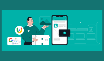
Build Virality Into Your Product (Snappr)

What’s one of the best ways to generate new leads and increase your conversion rate? Develop a product with built-in virality.
That’s exactly what we did for Snappr, a marketplace that helps users find photographers. After graduating from Y-Combinator and raising millions of dollars, Snappr came to us to design a product that would help build brand awareness. The LinkedIn Profile Photo Scanner and Snappr Dating Photo Analyser, both featured as Products of the Day on Product Hunt and generating a couple hundred thousand users. You can learn a little more about our 3 Steps to Exponentially Grow Your Business Without Busting Your Budget.
The takeaway? Add a shareable component to your product. Add a prompt within your product that encourages your user to share a special milestone with their social circle.
Virality builds brand awareness.
Trigger Users to Action (Duolingo)

Products should never be passive experiences.
If you don’t prompt the user to action, nothing will happen. It’s your job to get the user engaged with your product. If they leave, you’ve got to bring them back.
Use internal and external triggers in your UX to prompt action. For example, appealing to a user’s emotions can trigger them to act. Powerful emotions to tap into include urgency, fear of missing out, sadness, and joy. Duolingo uses sadness (an internal trigger) in their emails (an external trigger) to tug at their user’s heartstrings and get them back into the app. In the examples provided, Duolingo proactively reached out with an incentive on my birthday and when they detected a lack of engagement.
Leverage Social Proof (Insight Timer)

Every product should include some sort of social proof.
Social proof is a popular marketing tactic. It’s based on the idea that people are influenced by each other, i.e. If someone else likes it, so will I.
There are a lot of ways to use social proof to suggest the quality and value of your product. Here are a few ideas:
- Show how many users you have
- Include testimonials from your customers
- Add certifications
- Show recent signups and purchases
- Create a sense of community
- Link to case studies that highlight customer success stories
Include social proof in your product to validate users and make them feel like they’re part of a larger community. Many users take comfort in following others. Insight Timer heavily leverages their community in creating a strong sense of belonging and togetherness. I’m personally reminded everyday that there are thousands of other mindfulness individuals meditating with me after my morning routine.
Avoid Overwhelming Your User (Vyte)

Understanding how to harmonise what customers really want, with a clear and simplified experience can boost revenue targets out the roof. If you want to learn how we helped Vyte increase their user activation rate by 75%, you can read all about it here.
Think about your product from the user’s point of view. They don’t know anything about your product. They need a guide to help them understand exactly what to do to get from point a to point b. Notice I didn’t say point z. Too much info will overload your user and definitely slow them down.
Don’t do this. An overwhelmed user is not a happy one. They’re more likely to leave early without seeing the benefits of your product because they are frustrated with too much to learn and do.
Instead, break down your onboarding process into small steps that won’t intimidate the user. They don’t need to know everything at once. They only need to know what to do next.
Give Your Customer Value Right Away (Autotrader)

When the team at Cox, a Fortune 500 company, approached us to introduce Autotrader to the Australian market, they were looking to create a better UX for their customers. Whether you’re buying or selling a car, the process can be confusing and frustrating. Their team wanted to reduce friction and provide value for their customers right away.
We developed a feature that immediately solved the most common car seller’s pain point: Not knowing extensive information about their vehicle. Instead of harassing sellers to recall everything about their car, from make to engine type, we cut it down to three questions which made the process easy, quick, and frictionless. Users received value right away and were one step further down the funnel. If you want to learn more about the process and thinking behind Autotrader, learn how we redefined the way Australian’s sell cars here.
When creating a product, focus on solving one customer pain point right away. This builds credibility in your product and causes the customer to trust you.
Show Your Customers You Care (Yard Home Loans)

When the Yard Home Loans team reached out to us, they were looking to create an entirely new brand and UX for their customers.
The team wanted us to help emphasise and clearly communicate the team’s vision, mission and values.
“Yard exists because we want to improve your understanding and experience with financial services, simplifying flows and systems that make financial decisions transparent and ethical.”
We included a number of design decisions that helped support and communicate to customers that the team genuinely cared.
- We added multiple human touch points through out the experience, to remind the user the team’s only a click away if they had any questions.
- We brought questions from the funnel onto the homepage, to reinforce the fact that the experience is personalised.
- Following on from the tip above, we focused on delivering value right away, even on the homepage with a refinancing and purchasing calculator.
There are many ways to show to your customers you care, but it’s always best to show it rather than say it.
The Bottom Line
Your product is made for your customers and it’s also the life of your business. If your customers don’t find value in it, it doesn’t matter how fancy it is or how much time and effort you’ve put into it. It just won’t work.
Time and time again, we’ve been able to bring clarity and confidence to our clients.
If you’re curious about how we might be able to help you in strategising and building your own amazing product from scratch. Let’s talk about it. Schedule your FREE, 45-minute RAW-5 Framework with us and see how we can make it happen.
Take your company to the next level and get results with our world class user experience, interface design and implementation.
Get a FREE 30 min Strategy Session
Related posts

Design Guide for Startup Founders Building a Product
You have found your lightbulb moment and have an idea to revolutionise an industry. You’re ready to start your business; […]

More Than Homeshare: Learning from Airbnb’s Journey to UX Leadership
Airbnb has revolutionized the travel industry, transforming hospitality from a rigid, standardized experience to a diverse and personalized one. But […]

Effective UI/UX Design: How Psychological Principles Enhance User Experience
Imagine landing on a website that feels effortless to use, where every click feels natural and every visual element seems […]
Creative product design that gets results
Take your company to the next level with world class user experience and interface design.
get a free strategy session
