9 UX Tips for User Onboarding
The onboarding experience is critical in the acquiring and retention of customers.
According to Wyzowl’s 2020 survey, over 90% of interviewees feel that the companies they buy from ‘could do better’ when it comes to onboarding new users/customers. On top of this, 88% of people say they’d be more likely to stay loyal to a business that invests in onboarding content that welcomes and educates them after they’ve bought.
Well there you have it, user onboarding seems to be one of the most important parts of the customer journey. It really sets the stage for everything to come. You could have a fantastic product with ground-breaking features, but if your onboarding process is a total headache, your customers will probably give up before they even get the chance to enjoy your creation.
In such a competitive culture that is continually aspiring for a customer-centric approach, onboarding can give your business the edge it needs to reduce customer churn for maximum profitability.
Below are just a few practises you can utilise when creating an onboarding experience. We delve into how we at Raw.Studio have utilised these tips in our past projects, and some great examples from other companies.
Table of Contents
1. Know your customer
Sounds relatively simple, right? Unfortunately, it’s something that many companies struggle with on a daily basis. Understanding the user who interacts with your product is the first step in creating a more customer-centric experience. You need to delve into their wants, needs and expectations of your brand and product
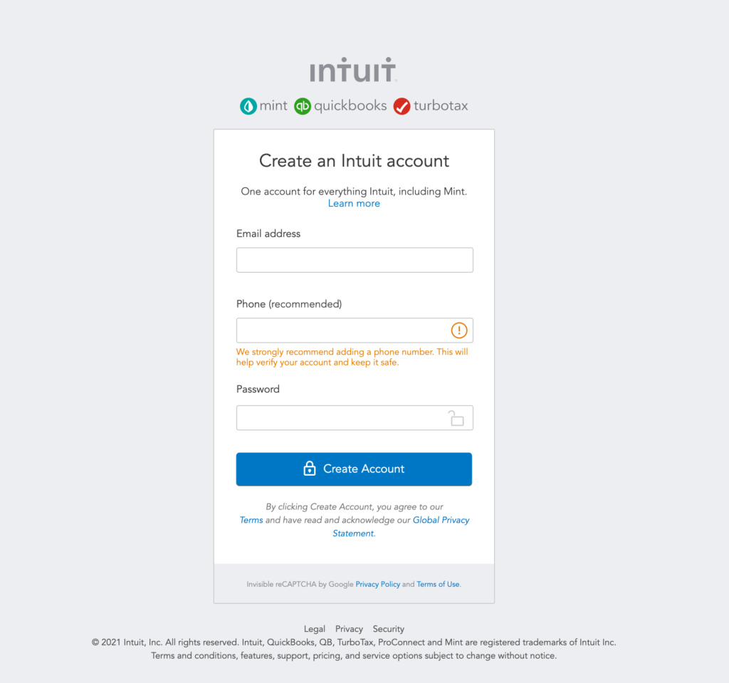
Intuit’s Mint is a money management platform. It is common knowledge that one of the biggest concerns of users on financial platforms is security. Intuit make sure that in their sign up process they included symbols of padlocks to emphasise the secure nature of the product. They also highlight under the optional mobile number field that they “strongly recommend adding a phone number. This will help verify your account and keep it safe.”
Optimising your customer experience by listening to your users wants, needs and concerns is a great way to get new customers is also one of the best ways to foster customer loyalty.
2. Set some standards
Your customer should know exactly what they’re in for. This allows the onboarding user to feel assured in their actions and not feel lost or confused, so be sure to keep your user in the loop at all times. This could include providing them with relevant information on the home page regarding your product, explanatory videos or clear steps outlining the sign up process.
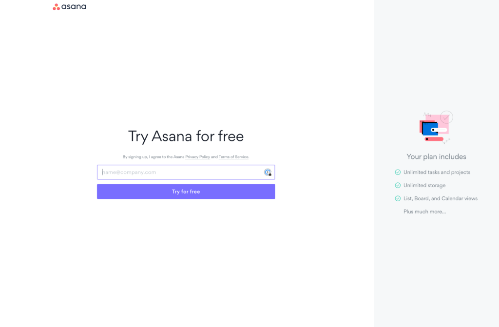
Asana allows you to try their product for free. The inputs are incredibly minimal, only requiring an email address initially. They also incorporate what you should expect from this free trial experience on the right hand side under “your plan includes,” keeping the users totally informed of what they’re signing up for.
This transparency will only benefit your business and its reputation in the long run. Ambiguity will just leave a bad taste in their mouth, so don’t leave them with any nasty surprises or sign up expenses.
3. Break it down
A common mistake that can be made is condensing all of the onboarding steps into one page. If it is a simple onboarding process with only a few input fields, then this is perfectly fine. When sign up processes need to have a lot more steps, things can get a little confusing for users. It can be incredibly intimidating and overwhelming, overall resulting in an increase in churn rate.
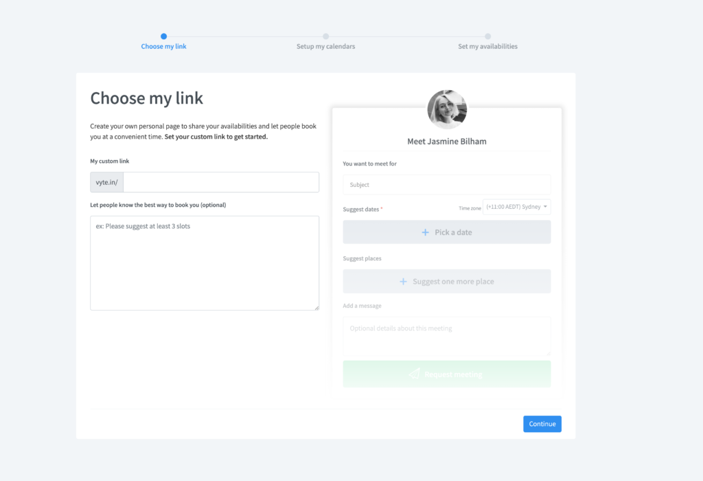
Above is an example from our client Vyte, where you can see that the onboarding has been divided into three sections to be easily absorbed one step at a time.
Creating an experience that is segmented will allow the user to digest the content a lot easier and reduce any friction.
4. Be content-conscious
The decision to find the right balance of content and simple ease of entry into your platform is an art all in itself. The best kind of sign up forms provide the bare minimum information-wise, lowering the barrier to entry to get the customer through the door.
Linkedin only provides what is necessary at the start. Of course, once a user has signed up they need to put a lot more information about your work and skillsets to complete their profile, but at the start they keep things minimal to create a quick and smooth onboarding.
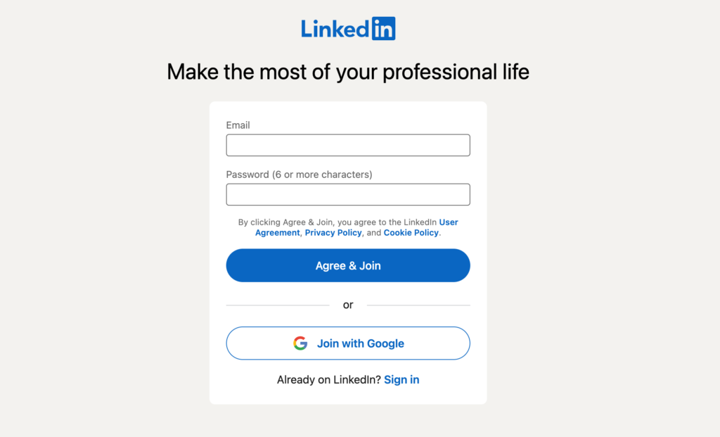
Make sure that you ask for the absolute minimum from the user. Whether that just be e-mail and password, or even just an email in some instances! Obviously every company is different in what information they require, but just remember that every additional / unnecessary field is just an opportunity for your client to drop off.
5. Personalise for your customer
User experience personalisation is now woven into the fabric of many of our digital experiences. No user is the same and each individual will most likely want different things out of your product. A user will feel far more valued if the experience is tailored to their requirements.
Keeping your eCommerce CTAs to “Shop,” “Add to Cart,” and “Buy” are simple and easy to understand. You can also take it up a notch and strategically add a sense of urgency, for example “Shop now” and “Buy now”
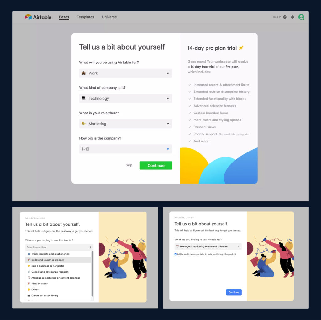
Airtable do a fantastic job at allowing their user to have a personalised experience. They ask what the user hopes to use the product for – and from there the following questions are personalised to your previous answers.
Below you will see an example from our client Vyte, where we tailored the experience and sign up flow depening on what kind of meetings they wanted to reschedule.
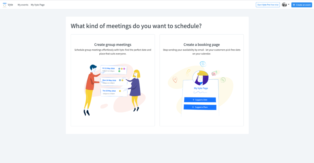
Yes, it is a little more effort to construct something personable as opposed to universal, but it will do your business a world of good – both with onboarding conversions and returning customer loyalty.
6. Show value in this experience
No one wants to waste their time signing up for a product they’re not entirely sure will bring any value to their day-to-day. We are time-weary individuals and don’t like to invest (both time and money) in things we won’t really benefit from in any way.
Our onboarding experience for one of our previous clients Compare & Connect is stationed on the landing page. Aside from the fact that we kept the onboarding input fields to a minimum, we also made sure to clearly display the value in this product. We express in iconography all of the difference categories they provide, such as electricity and gas. Below this, we show how Compare & Connect help the user connect to these ‘perfect plans.’
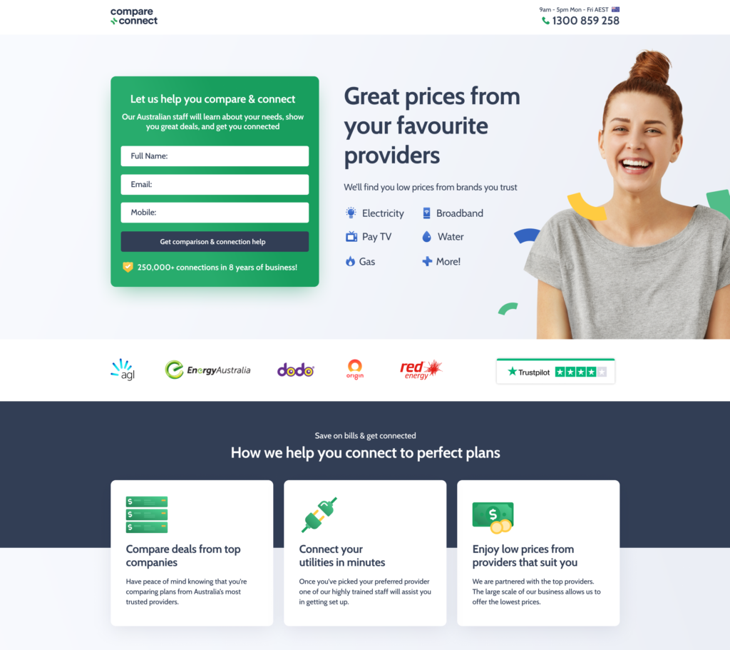
Your landing page is a land of opportunity for selling your product, brand, ideas and values. Use this space to create a benefit-oriented headline and display the significance of your product, convincing viewers that they can truly benefit from it.
7. Make it social
Creating the ability to share the product, particularly in workplaces, is ideal for optimal workplace efficiency and communication. It encourages the user to continue the sign up as they know that it will be convenient. In the instance of non-work interactions, social media platforms provide multiple sharing options – whether it be sending your account link to others to connect, sending an instagram story to your friend, or a funny cat video to your family group chat, they are pretty good at keeping us connected and constantly coming back for more.
A current practise that brands use to make sure that their sign up process is as interactive and social as possible is the ability to sign in through outside platforms. Plenty of sites offer an option to sign in with Google, which is something many tend to opt into as it means they don’t have to punch in all their details, it’s usually just a google password and BAM – you’re good to go!
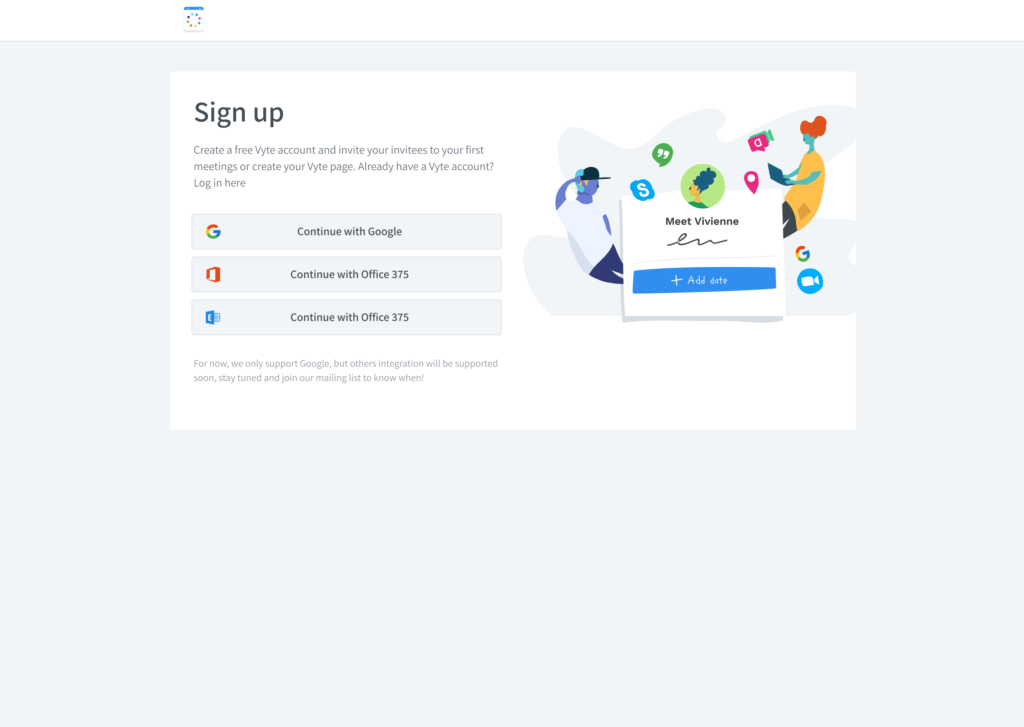
When working with of our clients, Vyte, we made sure that the sign up process was as seamless as possible by incorporating sign up links through Google and Microsoft Office. This way users feel like they’re saving time (and most likely do), mamking the sign up process more attractive.
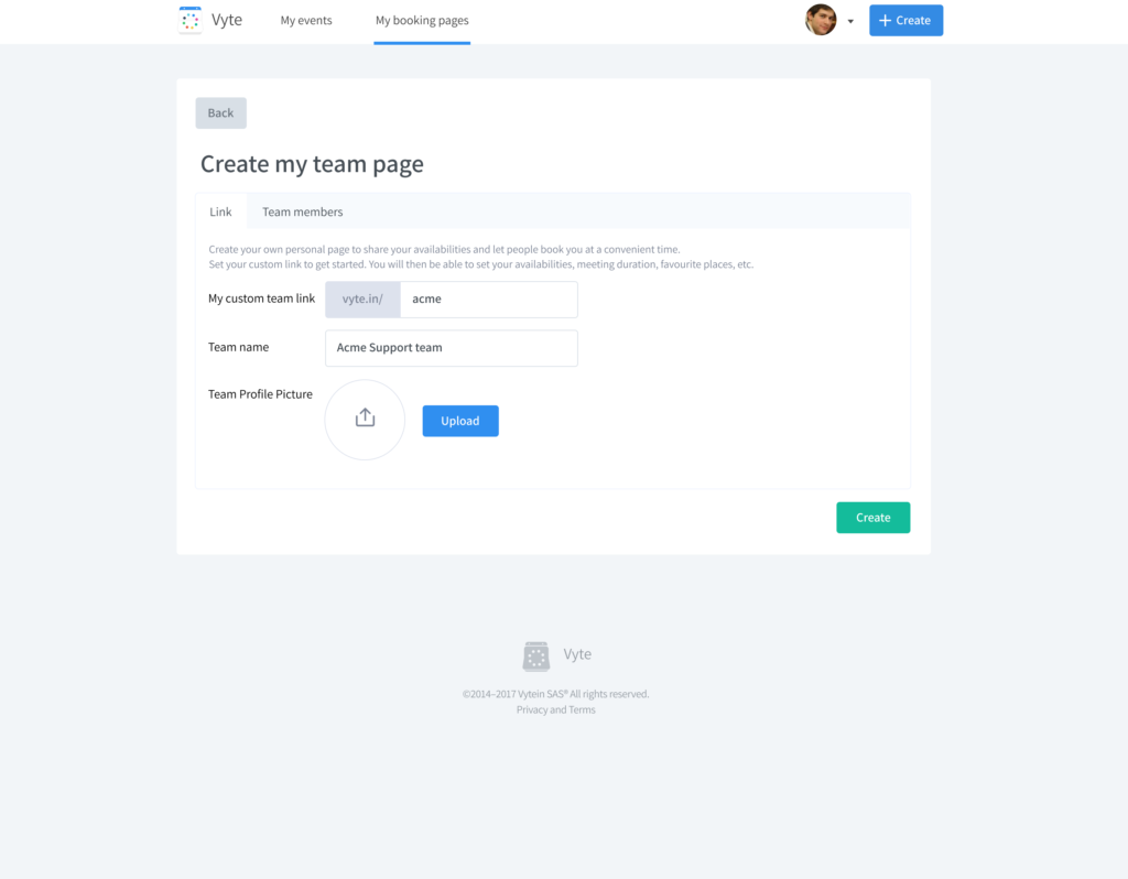
We also made sure to mention that this product would allow you to share within a team – eliminating that worry of future colleague sharing headaches. Sharing within Vyte is made easy with the option to create a team page by sharing a custom team link with your desired members.
8. Gamify it
The goal for implementing gamification concepts is to encourage participation while keeping users motivated. If a user feels involved and immersed in their experience, they’re much less likely to get distracted or disinterested and exit.
Incorporating components such as progress bars not only create digestibility due to segmentation, it is also a gamification element that encourages users to complete the entire process. Additional elements that have been utilised in sign up process include redeemable rewards (we’ve seen that “sign up for 10% off your first purchase” pop-up many times), Level-ups and interactivity.
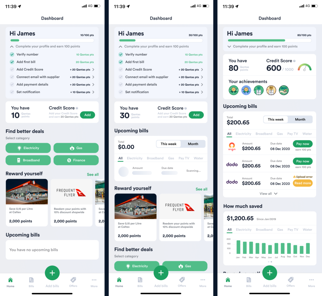
As you can see above, our work with 1Bill involved creating a user flow for those planning to manage their bills. We incorporated a progress bar at the top of the page to encourage the user to complete their profile.
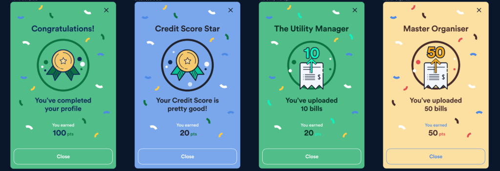
Once users completed their profile, or hit a particular milestone with amount of bills uploaded, they would receive a celebratory overlay with a badge to notify them of their achievements.
A successfully gamified process consists of linking business goals with development, frequent feedback, progress tracking, achievements and rewards, and timing the delivery of information in order to prevent information overload. When done correctly, your onboarding user will feel a thrilling sense of independence and accomplishment.
9. Track your success
All of these tips sound great, but how will you know that they’ll actually improve your conversions once you have them implemented?
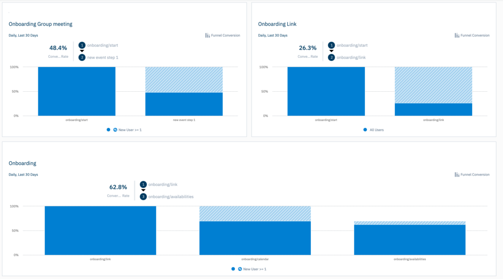
A key part to user experience is the constant requirement of reassessing and iterating. Be sure to utilise analytics in order to validate your decisions and continually enhance your customer experience. Amplitude is a great tool that can track your onboarding funnel to see when things are working smoothly, when they’re not and a clear indication of conversion rates.
Wrap up
It is evident that there are a lot of contributing factors in creating the ‘perfect’ onboarding experience. Our advice? Put yourself in the customer’s shoes. We want sign up processes to be simple, quick, digestible and valuable. So let’s create just that! Balancing these elements will bring you all the more closer to that enhanced (and of course, simplistic) user experience.
As stated brilliantly in Neil Patel’s blog post about Increasing sign ups, it is suggested to keep these two ideas in mind whenever you’re working on a signup page:
- Does this make it easier to sign up?
- Does this give a better reason to sign up?
If you can answer these two questions with a confident yes, you’re definitely on the right track toward increasing your sign up conversions and creating a customer-centric onboarding experience.
Take your company to the next level and get results with our world class user experience, interface design and implementation.
Get a FREE 30 min Strategy Session

Related posts
Prototyping: A Startup Founder’s Secret to Success
We’ve had so many grass-root startups come up to us with an extraordinary product idea but don’t know where to […]
UX Writing: What Is It and Why Does It Matter?
“Easy reading is damn hard writing.” Nathaniel Hawthorne (short story novelist) Hawthorne could not be more accurate. When interacting with […]
Threads Unraveled: How UX Flaws Weakened a Promising Social Platform
Threads emerged as a social media platform brimming with promise. Its unique focus on threaded messaging and ephemeral content aimed […]
Creative product design that gets results
Take your company to the next level with world class user experience and interface design.
get a free strategy session
