5 tips on Creating an Award-Winning App Onboarding
Table of Contents
Intro 👋
97% of companies say that good user onboarding is necessary for a product’s growth. This statistic from UserGuiding truly emphasises the importance of looking after your customer from that very first stage. Onboarding has the opportunity to set the tone for the user’s whole relationship with your product and company.
As of late, Raw Studio had two of their projects nominated at the Australian Web Awards of 2022, with all three tackling the challenge of a new user onboarding flow.
There were *insert drumroll*:
📈 Maqro, Finalist at AWIA Financial Service Awards **and,
🧮 1Question, Winning AWIA Mobile App Awards
In both of these projects, the team at Raw understood how necessary it was to help our clients onboard happy, loyal customers. Through User Research and general UX best practice, three flows were created, tailored to different target audiences.
Below, we’ll be looking into some tips to create an excellent onboarding flow, with some visuals and examples from the products listed above, as well as another valued client and previous project, 1Bill.
Who is your audience? Get to know them ✨
Winning a user over requires strategy, and selling a product or a new feature will not work unless you know what works for them. What do they need? What don’t they need? What are their frustrations? What makes a good experience for them? What do they need from you to make a decision? Do they even need your product?
Some common ways to empathise and connect with your users include:
🤔 Surveys. Surveys and questionnaires are suited when you need to gather demographic (fact-based) or psychographics (opinion-based) data. They allow you to get a surface-level understanding of who your users are, where they are from and what they like and don’t like.
🗣 User Interviews. Interviews, whilst typically more time-consuming than other methods, are a sure way to get meaningful, qualitative data. It’s where you can dig deeper than surface level, ask ‘why?’, assess body language and create a more personal connection.
📊 Utilising Analytics. Analytics allow you to tap into user viewing habits, like what device they use, when they drop off in a flow, how long they stay on a page and what the most visited pages are.
❤️ Monitor audience feedback, comments, and engagements. You know those little “How are we doing?” pop-ups that sometimes appear when interacting with a product? This is another way to measure user engagement and opinions. It can be a numerical rating, which is more on the quantitative side or something slightly more qualitative, like a text input where users can type freely.
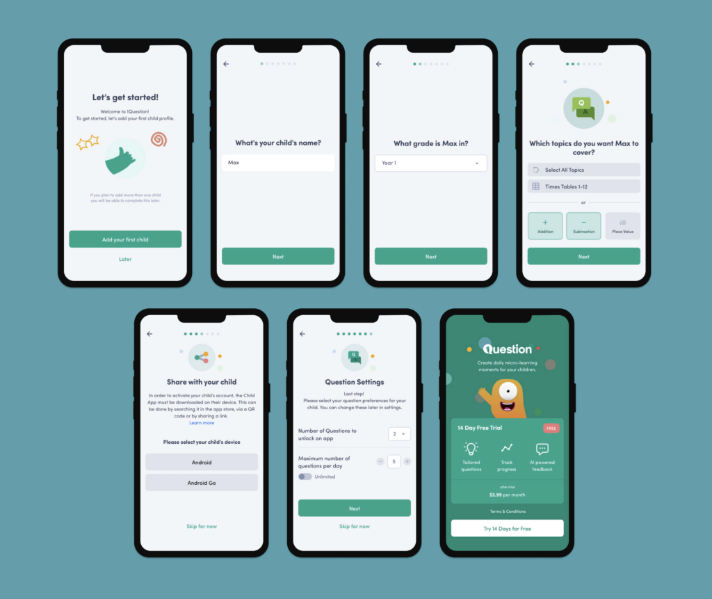
One of Raw.Studio’s clients, 1Question, required designs for two different onboarding experiences – one for the child version of the app, and one for the parent version, which controlled the settings of the child.
The team made the parent process a little more detailed, asking questions to do with the child’s information, what mathematical topics they wanted to cover, linking the accounts together, question settings and a subscription question at the end. This would not have been suitable for the child app and that is why it was placed in the adult/parent user flow.
Below are some snippets of the child app onboarding flow. It is a lot simpler, in an attempt to reduce cognitive load for the child. There was even a bit of fun added at the end by encouraging the user to add in an avatar, along with some small words of encouragement once everything is set up.
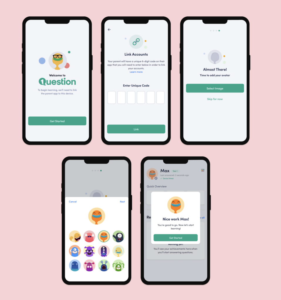
It would have been too much for the child to set up all of the controls and it would have been annoying for the parent if their onboarding flow was over-simplified and somewhat ‘childish’ – this is why it is important to recognise your user’s wants, needs and abilities before designing.
Let’s get them in the door 🚪
This can vary from product to product, but it is often said that the best onboard is a quick onboard. Getting your users through the door with as few steps as possible reduces churn as you won’t be testing their patience and attention span.
Some things need to be included in the signup flow, but others can be left for later. While it is nice going into an app with everything filled out, you can always design emptier states and encourage users to fill sections out themselves after they have signed up, whether through separate setup wizards, gamification steps, or motivating pop-ups.
A great feature that many products now include is the ability to sign in with social accounts such as Google, Facebook, Linkedin, Twitter, Apple ID… the list goes on!
According to a Web Hosting Buzz survey, 86% of users mentioned they were bothered by having to create new accounts. So, providing an alternative (and faster) onboarding method will increase the number of registrations to your site. The survey also states that 77% of respondents say that “Social Login is a good solution that should be on any site.”
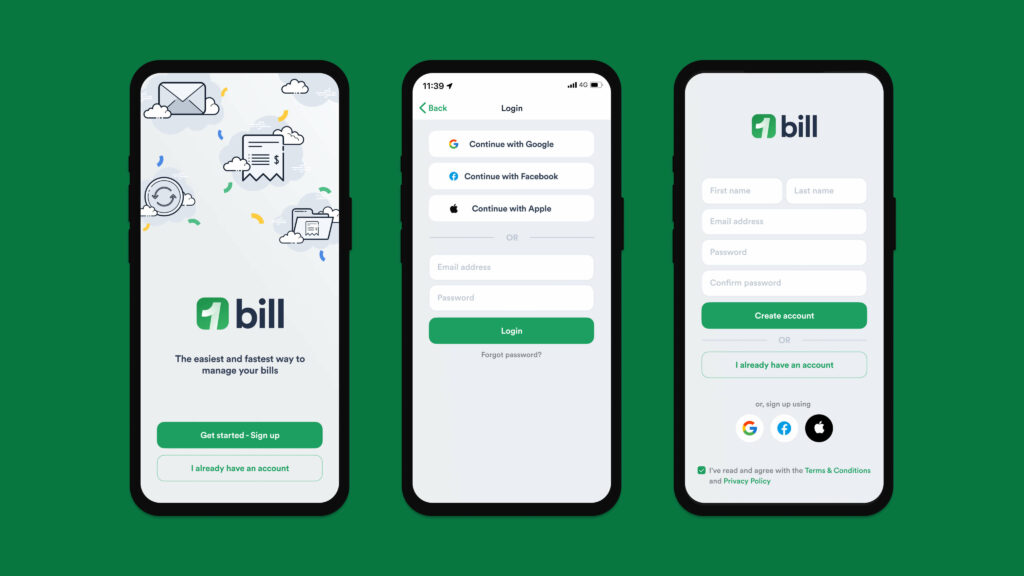
Above, you will see the signup process designs for creating an account with 1bill, where social sign-in and sign-up options are provided, allowing the user to save time and create an account quicker.
Another way to get users through the door faster is through a ‘skip steps’ function.
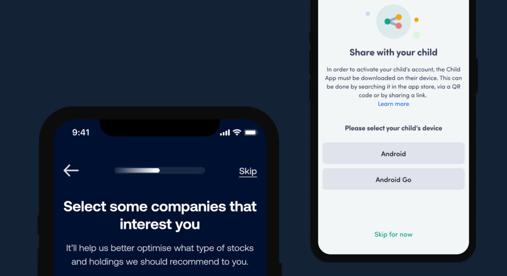
You can see in the examples above for Maqro and 1Question, that the design team included a ‘skip’ button for those sections that aren’t totally imperative. Exercising this practice will reduce the instances where people might get stumped on a particular step, reducing overall onboarding churn and user fatigue.
Make it digestible 🍎
Speaking of steps and in the words of one of our previous articles about onboarding,
“A common mistake that can be made is condensing all of the onboarding steps into one page. If it is a simple onboarding process with only a few input fields, then this is perfectly fine. When sign-up processes need to have a lot more steps, things can get a little confusing for users. It can be incredibly intimidating and overwhelming, overall resulting in an increase in churn rate.”
Too many user onboarding experiences force users into consuming large chunks of information in a short period of time.
Fortunately, there’s a better way. By breaking your onboarding experience up into bite-sized pieces, you can deliver to your users in a non-overwhelming way.
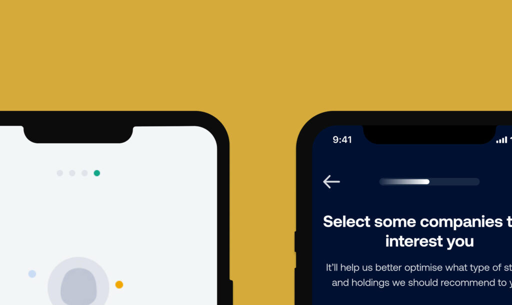
In the examples above, we have designs emphasising stages and progression during the onboarding progress, one with dots and the other as a progress bar. Bite-sized can still feel like a lot of steps, so it is important to express visually that the user is in fact making progress in the flow and that there is an endpoint.
So pace yourself, allowing your user time to take in, assess and appreciate each stage, which will provide an inviting and stress-free interaction.
Provide customisation 🎨
Yes, I know I have been putting a lot of statistics in this article, but they truly speak to the positive feedback and adoption of these particular practices. So, here’s another one:
86 per cent of consumers will pay more for a better customer experience. (Oracle RightNow)
Every human is unique in their very own way – with different tastes, wants, goals, needs, previous experiences, influences, opinions and preferences, which makes designing quite complex – in the best way possible. And we know as humans that we feel far more valued if the experience is tailored to our requirements.
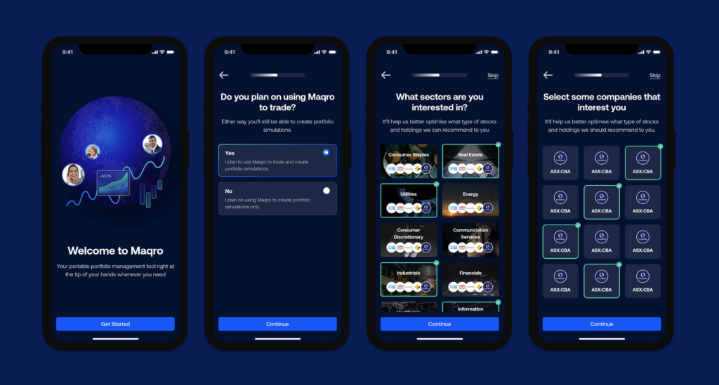
Maqro is an all-in-one platform for all your investing needs, so they can cater to both novices and experts. The design team incorporated some questions in the onboarding flow that then tailored their experience with the product later on, such as asking:
- Whether they plan to trade on the platform
- What sectors they are interested in
- What companies are of interest to them
The platform is then filtered to these particular preferences, enhancing the user’s experience.
Personalising your user onboarding isn’t just about adding their first name to emails. It’s about understanding each user’s individual journey toward reaching their goals. Incorporating questions in the flow that tailor the user’s experience when they enter the product is a sure way to add some immediate value.
Gamify things 👾
Gamification is an ever-growing trend. What was once a buzzword is now being adopted by more than 70% of businesses belonging to the Global 2000 list of companies according to a Gartner report.
Gamification incorporates the fun and engaging elements found in games and applies them to a product or experience. It taps into some of our most primitive instincts as human beings, making the experience all the more immersive. – Raw.Studio’s article on Gamification
Utilising gamification in your onboarding flow can have the same “stickiness” like a video game if it’s engaging. This can be done through progress bars, encouraging your user to complete their profile, or with points so that they feel they are getting value from this interaction. 1bill’s design revamp goal was to breathe life into what is often considered a mundane task – bill management. To provide the best service, 1bill needs the user to input a bit of information when signing up to the app. To encourage the user to do so, Raw.Studio implemented the strategy of rewarding the users by giving Qantas points every time they completed their profile, as you can see in the designs below.
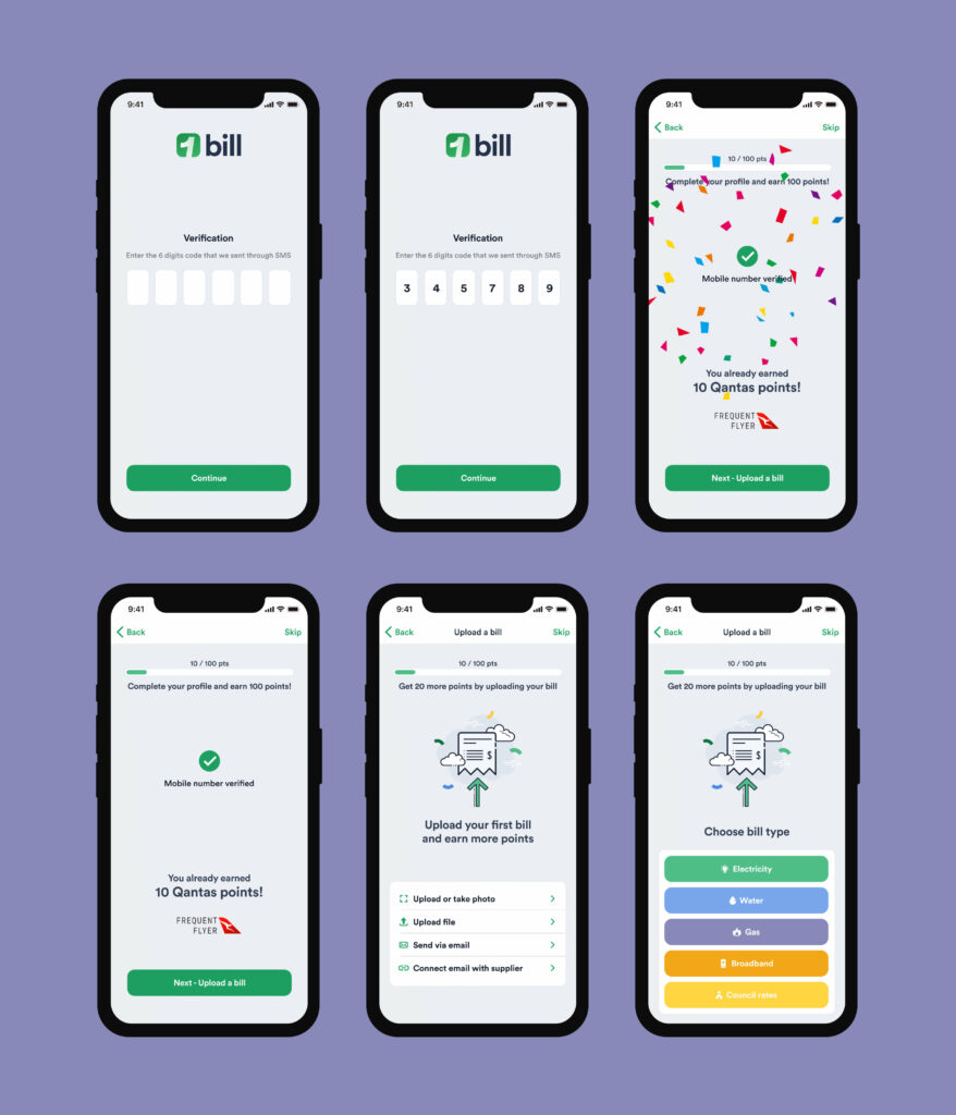
Implementing a tactic like this makes the process of reaching the activation points significantly more engaging, and in turn, creates more conversions for your business.
Wrap Up ✨
Depending on the sector, as many as 83% of those who download a mobile app will have uninstalled it within 24 hours. We’ve all given up on an app onboarding flow that was just too difficult or annoying.
The onboarding process is an exciting but high-risk stage in the overall user experience. But taking this as an opportunity to reduce clunkiness, listen to your customers, and adopt best practices will assist in empowering your users to realise the value in the product in those very first few minutes.
Take your company to the next level and get results with our world class user experience, interface design and implementation.
Get a FREE 30 min Strategy Session

Related posts
The Correct Way to Embed Accessibility in Your Design Process
No fancy introduction – 15% of the world’s population equivalent to more than 1 billion people live with some sort […]
Becoming a Better Designer in 2022 with Jacalin Ding
With nearly 100k apps being released every month, product design has really taken off in the last ten years or […]
What is UX & Why Is It Important For Your Business?
Intro User Experience – or more popularly known, UX, has gained compounding popularity in the last 10 years. But let’s […]
Creative product design that gets results
Take your company to the next level with world class user experience and interface design.
get a free strategy session
