

How Wise Uses 3 Transparency-First UX Principles to Build Trust in Fintech

Wise UX succeeds because it does not ask users to trust the brand before showing them why they should.
Sending money internationally is one of the highest-trust actions a person can take online. Users are not simply creating an account or purchasing a low-cost product. They are moving real money across currencies, banks, countries, and financial systems they cannot see.
That lack of visibility creates anxiety. A hidden fee can feel dishonest. An unclear exchange rate can make users question whether they are getting a fair deal. A vague delivery estimate can make them wonder whether their money is safe.
Even when the transfer works perfectly, the experience can still feel stressful if the user does not understand what is happening.
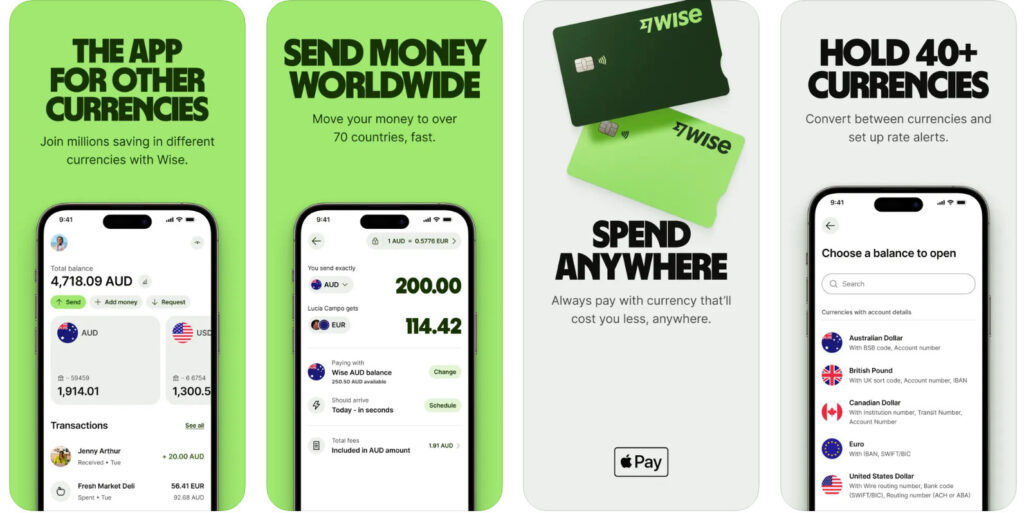
Wise approaches this problem differently. Instead of using reassuring language to cover uncertainty, its interface removes the reasons for uncertainty. It shows users what they will pay, how the amount is calculated, what the recipient will receive, and what happens after the transfer begins.
This is transparency-first UX, but its strength goes deeper than simply displaying more information.
Wise follows three powerful design principles: eliminate the trust gap before commitment, prove fairness inside the interface, and preserve the user’s sense of control after payment.
Together, these principles turn a complicated financial transaction into an experience that feels understandable, predictable, and safe.
Table of Contents
Why International Transfers Create a Trust Gap
Most digital products ask users to trust an interface.
Fintech products ask users to trust an interface with their money.
That changes the meaning of every design decision.
When someone sends money overseas, they are evaluating several risks at the same time. They want to know whether the provider is reliable, whether the exchange rate is fair, whether extra charges will appear, and whether the money will arrive when promised.
They may also be comparing the service with a bank, another transfer platform, or a method they have used before. Every unclear detail gives them another reason to pause.
International transfers have traditionally been difficult to understand. One fee may appear at the beginning of the process, while another appears during payment. A provider may advertise a low transfer fee but recover its margin through a less favorable exchange rate. Delivery times may be described with broad estimates that offer little reassurance.
This creates a trust gap between what the provider promises and what the user can verify.
Wise UX works because it recognizes that this gap is the real conversion problem.
The interface does not assume that users are comfortable with the transaction. It gives them enough information to understand the outcome before they make a commitment.
Instead of saying, “Trust us,” the product communicates, “Here is exactly what will happen.”
That difference is the foundation of the Wise experience.
Principle One: Eliminate the Trust Gap Before Commitment
The first principle behind Wise UX is not simply to show fees early.
It is to remove uncertainty before the user has to take a risk.
Before starting a transfer, users can see how much they are sending, what the service will charge, which exchange rate will be applied, and how much the recipient is expected to receive.
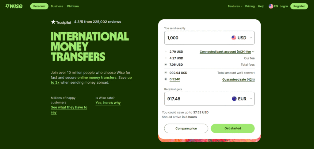
This gives the user a clear picture of the financial outcome before they enter payment details or confirm the transaction.
That timing matters.
Many products reveal important information only after the user has invested time in the process. By the time the full price appears, the user may have created an account, completed several forms, or provided personal information.
This can make the experience feel manipulative, even when the company has technically disclosed every charge.
Wise reduces this tension by presenting the cost while the user is still deciding whether the transfer makes sense.
The user does not need to wonder whether another charge will appear later. They do not need to perform their own calculations. They do not need to continue through the flow simply to discover the final amount.
The broader UX principle is powerful:
Trust should be earned before commitment, not requested at the moment of commitment.
This principle applies to any product where users must make a meaningful financial or personal decision. If cost, timing, risk, or eligibility could change whether someone proceeds, that information should appear while the decision is still reversible.
Transparency is strongest when users still have the freedom to walk away.
Raw.Studio’s article The State of UX 2026 discusses how modern UX is increasingly judged by measurable business impact, including conversion, retention, task success, and time to value. Transparent pricing supports all of these outcomes because it reduces the mental effort required to move forward.
Principle Two: Prove Fairness Inside the Interface
The second principle behind Wise UX is that fairness should be demonstrated, not claimed.
Many financial companies describe their pricing as competitive, affordable, or transparent. These words may sound reassuring, but they do not give users enough information to judge whether the claim is true.
Wise allows the interface to provide the proof.
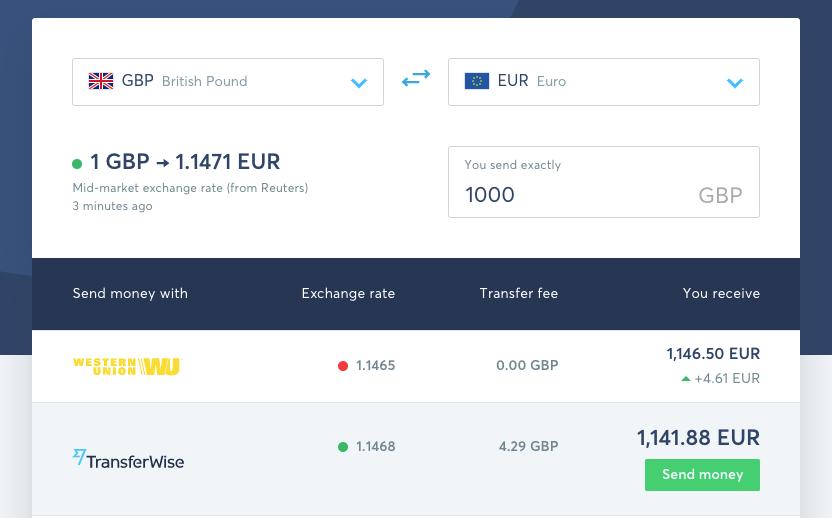
The exchange rate is shown as part of the transfer calculation rather than hidden in fine print. Users can see how the amount they send becomes the amount the recipient receives.
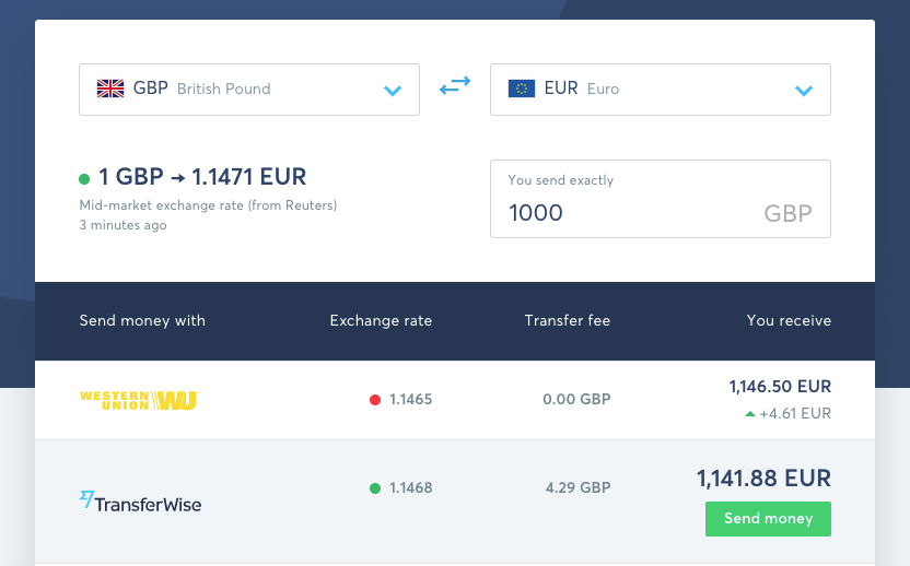
This is especially important because the visible transfer fee does not always represent the complete cost of an international payment.
A provider can advertise a low fee while using an exchange rate that is less favorable to the customer. The difference may be difficult to notice because it is hidden inside the conversion.
Wise reduces that ambiguity by making the rate visible and connecting it directly to the recipient amount.
The user is not only shown the result. They are shown how the result was produced.
This turns pricing into something the user can inspect.
The stronger UX principle is:
When users may question an outcome, show the evidence behind it.
This principle reaches far beyond currency conversion. It applies whenever a product generates a price, recommendation, approval, limit, forecast, or personalized result.
A loan platform should explain the factors that affect repayment. An insurance product should clarify what changes the premium. A marketplace should make its fees understandable. A subscription product should show how usage affects the bill.
Users do not need to understand every technical calculation. They need enough information to see that the result is reasonable and that the company is not hiding something important.
Wise uses the product experience to support its brand promise. The company does not rely only on marketing language about fairness. It places the information required to evaluate fairness directly inside the transaction.
That alignment makes the product more credible.
The strongest trust signal is not a badge, testimonial, or slogan. It is an interface that allows the user to verify what the company says.
Principle Three: Preserve Control After the User Clicks Send
The third principle behind Wise UX is that trust must continue after conversion.
Before sending money, users want certainty.
After sending money, they want control.
The problem is that the user no longer has direct control over the transaction once the payment begins. The money moves through banks, payment systems, compliance checks, and currency networks that remain largely invisible.
A simple confirmation message does not remove that anxiety.
The user still wants to know whether the payment was received, whether the transfer is being processed, whether anything is causing a delay, and when the recipient should expect the money.
Wise addresses this by making the transfer visible as it moves through the process.
The interface communicates what has already happened, what is happening now, and what should happen next. The transfer becomes a sequence the user can follow rather than a financial process they are expected to trust blindly.
This creates a sense of control even when the user cannot directly influence the outcome.
The deeper UX principle is:
When the user loses control of the process, the product must increase visibility.
This principle is critical because conversion is not the end of a high-stakes journey.
A user may complete the payment successfully and still leave with a negative impression if the waiting period feels confusing. They may repeatedly check the app, contact support, or worry that something has gone wrong.
The final outcome may be successful, but the emotional experience can still feel like a failure.
Wise protects trust during this vulnerable period by continuing to communicate.
This also reduces pressure on customer support. When the interface explains the current status and expected next step, users do not need to ask for information that the product should already provide.
The same idea applies to loan applications, insurance claims, account verification, deliveries, bookings, approvals, software implementation, and any other process where the result is delayed.
A confirmation screen says that the process has started.
A transparent status experience proves that the process is still under control.
Wise UX Designs Around the Three Moments When Trust Can Break
The strength of Wise UX becomes clearer when the three principles are viewed as one connected system.
Trust can break before the transaction if the user cannot predict the final cost.
It can break during the decision if the user cannot understand how the price was calculated.
It can break after payment if the user cannot see what is happening to their money.
Wise addresses each of these moments.
Before commitment, it makes the outcome clear.
During evaluation, it makes the calculation understandable.
After payment, it makes the process visible.
This continuity matters because transparency cannot be limited to one screen.
A transparent price followed by an unclear payment process still creates anxiety. A clear exchange rate followed by vague delivery information still weakens trust. A detailed status tracker cannot repair the frustration caused by a fee that appeared too late.
Every stage must support the same promise.
The product should feel as honest after payment as it did before payment.

Transparency Is More Persuasive Than Reassurance
Many companies try to solve trust problems by adding more persuasive content.
They introduce security badges, customer testimonials, guarantees, reassuring messages, and claims about reliability.
These elements can support trust, but they cannot replace clarity.
A user who does not understand the final price will not be fully reassured by a testimonial. A user who cannot see where their money is will not feel calm because the confirmation page contains a security badge.
Wise uses a stronger form of persuasion.
It makes the experience itself understandable.
When the complete cost is visible, the product feels more honest. When the calculation can be inspected, the company feels more credible. When the transaction can be followed, the service feels more responsible.
The interface does not merely tell the user to feel confident. It removes the reasons they might not.
This is why transparency is not only an ethical design choice. It is also a practical conversion strategy.
The less uncertainty users experience, the less persuasion they need.
How Other Fintech Products Can Apply These Principles
Fintech teams can begin by identifying the moments when users are being asked to proceed without enough information.
The first question should be whether users can accurately predict the outcome before committing. They should understand the full cost, the amount they will receive, the amount they must repay, or the financial consequence of the action they are taking.
The second question should be whether users can understand why the product produced a particular result. Important calculations should not feel arbitrary. The interface should explain the variables that materially affect the price, rate, limit, or recommendation.
The third question should be whether users can follow the process after they act. When an outcome requires settlement, approval, verification, delivery, or review, the product should continue communicating until the process is complete.
These questions help teams move beyond surface-level transparency.
The goal is not to place more information on every screen. More information can create confusion when it is poorly timed or badly explained.
The goal is to reveal the information that reduces uncertainty at the exact moment the uncertainty appears.
That is the difference between displaying information and designing for trust.
Final Thoughts
Wise UX demonstrates that users do not trust financial products because those products look polished.
They trust them because the experience makes an uncertain decision feel predictable.
Wise eliminates the trust gap before commitment by showing the financial outcome early. It proves fairness by exposing the exchange rate and calculation inside the interface. It preserves control after payment by making the transfer visible until the money reaches its destination.
These principles are stronger than a collection of interface features.
They describe how a product should behave when users are taking a meaningful risk.
Earn trust before asking for commitment.
Prove important claims through the interface.
Increase visibility when the user loses control.
When these principles are applied consistently, transparency becomes more than a brand value. It becomes the structure of the entire experience.
We Design Fintech Experiences That Reduce Doubt and Increase Action
Fintech users need more than attractive interfaces. They need products that make complex decisions feel understandable and safe.
Raw.Studio helps businesses design fintech products, websites, and conversion journeys that reduce uncertainty, strengthen trust, and guide users toward action.
Whether you are improving an onboarding flow, redesigning a pricing experience, or simplifying a high-trust transaction, better UX can turn hesitation into confidence.
Get a free UX audit and proposal from Raw.Studio
Get a UX & CRO Expert’s Eyes on Your Website. Book a free 30-minute UX Teardown and get actionable insights on what’s costing you conversions — no fluff, just fixes you can implement right away.
Book a Free UX Audit

Related posts
How TikTok Uses 3 Algorithm-Driven UX Systems to Maximize Engagement
TikTok UX does not simply show people short videos. It creates a highly responsive content experience that learns what each […]
How Figma Uses 3 Collaboration UX Patterns to Drive Product Adoption
For years, digital design was treated as a largely solo activity. A designer worked in a desktop application, saved a […]

Top 10 Website Design Agencies in Australia in 2026
Australia’s digital economy is expanding fast. As more companies go online, skilled website design agencies are becoming essential. A strong […]
Creative product design that gets results
Take your company to the next level with world class user experience and interface design.
get a free strategy session
