
1 Hero Metric, 4–6 KPIs: SaaS Dashboard Design for Designers and PMs

A good SaaS dashboard shows one hero metric, backed by four to six supporting KPIs, and answers exactly one decision per screen. Everything else is scaffolding. Build with a sidebar plus 12-column card grid, hold every visual group to the Rule of 6, and treat empty states and mobile layouts as requirements, not polish you get to later.
Table of Contents
What Makes Great SaaS Dashboard Design Actually Work?
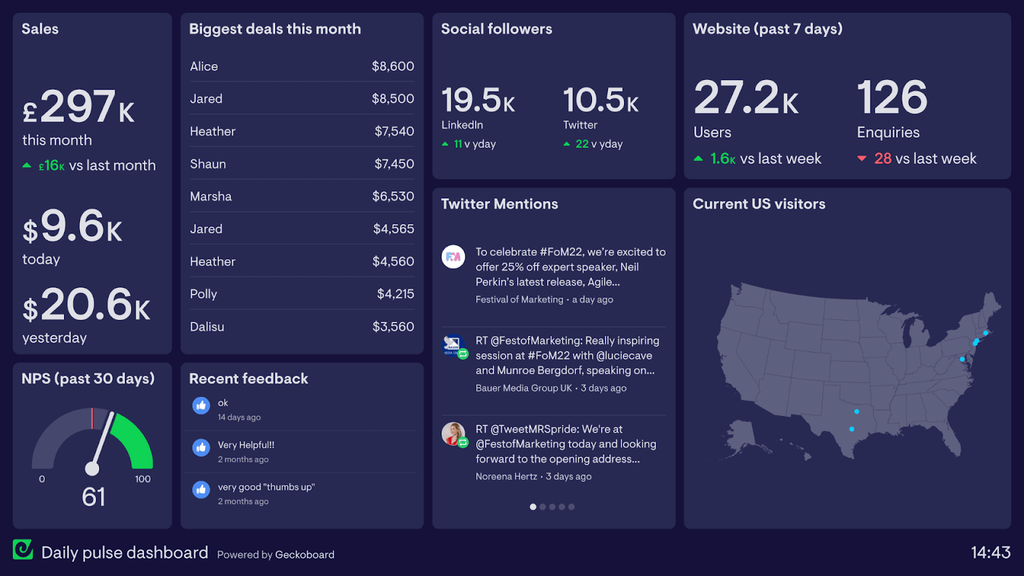
Dashboards fail for a boring reason: they try to answer too many questions at once. A finance director opening a churn dashboard doesn’t want ten charts fighting for attention. She wants one number, one trend, and a clear sense of whether she should worry today. That’s the whole job.
SaaS dashboards generally sort into four families: strategic, operational, tactical, and analytical. Matching the dashboard to the job the user is actually doing avoids the “one screen tries to be everything” trap, a pattern design taxonomies consistently identify as the root cause of cluttered interfaces. An executive dashboard and a support-team monitoring board should look nothing alike, because they’re answering different questions at different speeds.
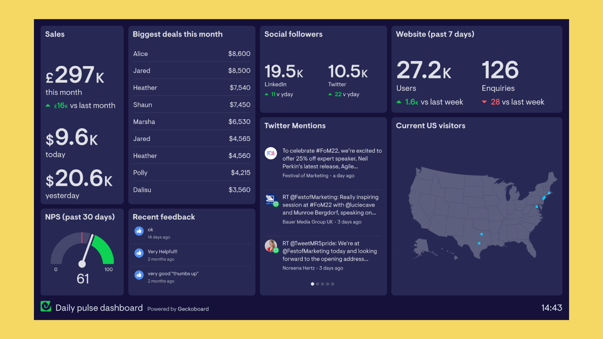
The most resilient layout pairs a 3 to 4 KPI top strip with a standard 12-column grid and progressive disclosure underneath. Here’s how that shows up across the four common patterns:
- Hero KPI strip. Used by executives and PMs scanning health at a glance. Each card needs a number, a delta, a time window, and often a sparkline. Nothing more.
- Table-first layout. Best for operations teams managing accounts, tickets, or transactions where each row needs to be actionable, sortable, and precise down to the decimal.
- Monitoring grid. Common in DevOps and support tools. Repeatable panels, consistent color states, and type large enough to read from across a room on a TV mount.
- Analytics and exploration. Built for analysts who need to drill from a summary chart into segments, cohorts, or raw rows without losing their place.
- Embedded client portal. Client-facing dashboards inside a SaaS product. Lead with next-best-action CTAs and an activity feed rather than raw metrics, since the audience isn’t fluent in your data model.
Copy the anatomy of these patterns freely. Adapt the specific metrics and colors to your product, but don’t reinvent the skeleton.
The Design Principles Every Dashboard Should Follow
Good dashboard design principles are testable, not aesthetic opinions. Run every screen through this checklist before you call it done:
- One decision per screen. Name the decision the user needs to make, then work backward to the metrics that support it. If you can’t name the decision, the screen doesn’t need to exist yet.
- One hero metric, four to six supporting KPIs. More than that and you’ve built a report, not a dashboard.
- Rule of 6 per visual group. Cap any cluster of cards, chart series, or table columns at six items. Beyond that, comprehension drops fast.
- Top-left hierarchy. Place the most important view in the upper-left, following natural F-pattern scanning, a placement rule Tableau’s own guidance backs for exactly this reason.
- Show change, not just state. Pair every raw number with a delta. “1,204 signups” tells you less than “1,204 signups, up 8% week over week.”
- Round deliberately. Use “$1.2M,” not “$1,204,532.18.” Precision to the cent rarely changes a decision and it slows every glance.
- Reserve saturated color for alerts. If everything is red or green, nothing is. Use neutral tones for normal states and save strong color for the exceptions that need attention.
- Favor bar and line charts over pie and gauge charts. They’re faster to read accurately, and they scale better when a category grows from three items to nine.
Designing around a single decision and showing deltas instead of raw state increases actionability far more than adding another chart ever will, according to dashboard design research from SetProduct.
Run a contrast check against WCAG AA minimums (4.5:1 for text) before handoff. It’s the cheapest accessibility win available and the one teams skip most often.
Which Layout Pattern Fits Your Dashboard?
The right layout depends on how the user’s eyes and hands need to move, not on what looks impressive in a portfolio shot.
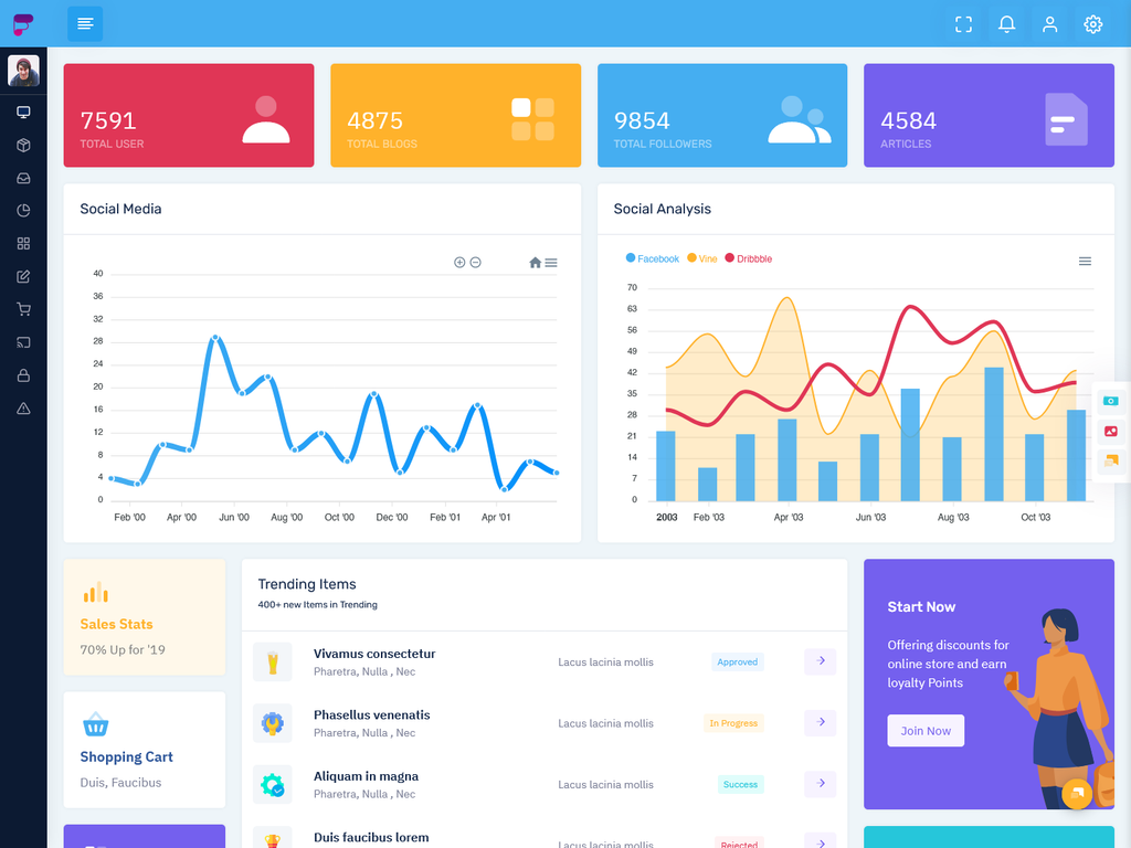
- Sidebar + 12-column card grid is the safest default for most SaaS products. Collapse the sidebar to roughly 64 to 72 pixels of icon-only width on smaller viewports, and keep the card grid flexible enough to reflow from four columns to two without breaking card anatomy.
- Table-first layouts need right-aligned numerals, muted gridlines, and status chips rather than raw text, a combination that admin dashboard research flags as the difference between a scannable table and a wall of numbers. Give every row its own sort and action affordance instead of routing critical decisions through a chart above it.
- Panel or monitoring grids work best with a repeatable panel anatomy: title, current state, threshold indicator, and last-updated stamp, all sharing one color-state system across every panel on the board.
- Minimal top nav or command-palette patterns suit keyboard-heavy, power-user tools where speed matters more than visual hierarchy. If your users live in the product eight hours a day, they’ll take a keyboard shortcut over a sidebar click every time.
Session length is a useful tiebreaker for light versus dark defaults, since longer monitoring sessions tend to favor darker interfaces that reduce eye strain over a full shift. Raw’s own take on when to choose sidebar, minimal nav, or panel grids walks through the tradeoffs in more depth.
How Should Dashboards Change by Role and Device?
An executive, an operations lead, and an analyst should never see the same dashboard defaults. Map the hero metric and supporting KPIs to the role first, then build.
- Executive: Hero metric is usually revenue or growth rate, with 4 to 5 supporting KPIs on a default 30 or 90 day range.
- Operational: Hero metric is throughput or open tickets, refreshed hourly or in real time, with drill-down into individual rows.
- Analytical: No single hero metric. Instead, a comparison-first layout with filters and cohort controls up front.
On mobile, don’t just shrink the desktop grid. Rebuild it: stack multi-column cards vertically, swap dense charts for summary cards with sparklines, and push secondary detail behind progressive disclosure. Keep touch targets at a minimum of 44×44 points, and always show a “last updated” timestamp so users know how fresh the number in front of them actually is.
Pro Tip: Default every role’s dashboard to the shortest time range that still tells the truth. Executives rarely need hourly granularity, and giving it to them by default just adds noise to their first five seconds on the page.
What Belongs on the Pre-Launch Checklist?
Handoff breaks more dashboards than bad design does. Before a dashboard ships, run through this sequence:
- Design empty states first. They should show what value will appear and the next action to take, not just “no data yet,” a distinction empty-state guidance treats as a missed onboarding opportunity when done poorly.
- Use skeleton loaders over spinners for anything with a predictable layout, since skeletons preserve perceived structure while data loads.
- Stress-test with real production data, including long currency strings, negative percentages, and nine-digit numbers, the exact edge cases that break static Figma layouts once real data arrives.
- Set performance budgets and hold to them.
| Deliverable | Why engineering needs it |
|---|---|
| Vector components with semantic tokens | Consistent restyling without redlining every screen |
| Responsive rules per breakpoint | Prevents ad hoc mobile decisions during build |
| Accessible contrast specs | Removes guesswork on color pairing |
| Chart labeling and interaction notes | Defines drilldown, filter, and tooltip behavior precisely |
A first meaningful paint under 1.5 seconds and full interactivity under 2.5 seconds are reasonable targets worth designing lazy-loading around, particularly for below-the-fold widgets and paginated tables.
What Raw Studio Has Learned Building Dashboards
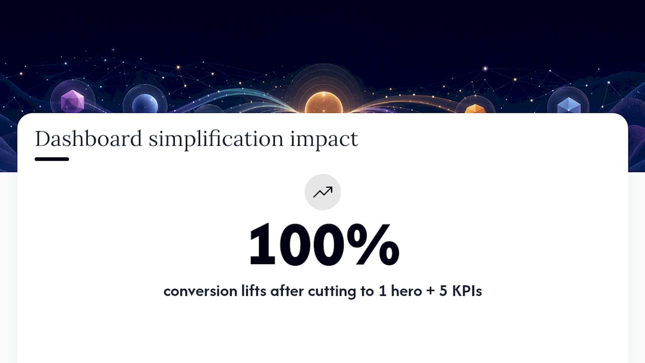
Across finance, health, and SaaS engagements, Raw has repeatedly seen the same fix move the needle: cutting a dashboard from fifteen metrics down to one hero number and five supporting KPIs. Clients who made that cut alongside broader UX work have seen conversion lifts as high as 100%. Raw’s dashboard mistakes breakdown covers the failure patterns worth avoiding before you ship.
Why Dashboards Are Decision Surfaces, Not Report Cards
Teams keep treating dashboards as reporting tools when they’re actually decision surfaces. More metrics rarely produce better decisions. Mapping each metric to a specific action does. Durability comes from consistency and real performance under load, not from a prettier chart. If you’re unsure your current dashboard clears that bar, a rapid MVP or a UX audit will tell you fast.
— Philippe
Get a Free UX Audit for Your Dashboard
Raw is the alternative to guessing your way through a dashboard redesign. Instead of another round of internal debate over which KPIs matter, Raw’s UX/UI team runs structured UX design work and rapid MVP prototyping to get a validated dashboard in front of users in weeks, not quarters.
If you’ve been nodding along to the Rule of 6 and the one-decision-per-screen principle but aren’t sure how your current dashboard measures up, that’s exactly what a Free UX Audit is for. It reviews your information architecture, KPI selection, and empty states before your engineering team spends a single sprint building the wrong screen. Teams building agency-style client reporting workflows may also find value in AI-assisted productivity tooling for scaling dashboard iteration without adding headcount. For teams that also need the interface itself built out, Raw’s UI Design service turns validated patterns into production-ready component libraries. Book the audit and find out what to fix first.
Get a UX & CRO Expert’s Eyes on Your Website. Book a free 30-minute UX Teardown and get actionable insights on what’s costing you conversions — no fluff, just fixes you can implement right away.
Book a Free UX Audit

Related posts

Top Branding Agencies in Australia in 2026
In 2026, branding is much more than just appearances. For Australian businesses facing tough competition and global markets, branding now […]

AI Won’t Kill UX, Our Habits Will: Why Designers Must Stay Intentional
Let’s be honest: AI isn’t ruining UX. We are. Not on purpose but through habits we don’t always notice. We […]
How Uber Increased Ride Conversions by 14.5% with 3 Friction-Reducing UX Changes
Uber UX did not simply improve ride booking. It reshaped how people expect digital products to behave. Today, booking a […]
Creative product design that gets results
Take your company to the next level with world class user experience and interface design.
get a free strategy session
