
A/B Testing for Founders: How to Run Experiments That Actually Move Revenue

A/B testing has a reputation problem. Half the founders we meet think it is a button colour debate. The other half think you need enterprise-scale traffic before it is worth bothering with. Both are wrong, and the gap between them is where good revenue gets left on the table.
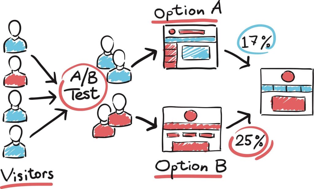
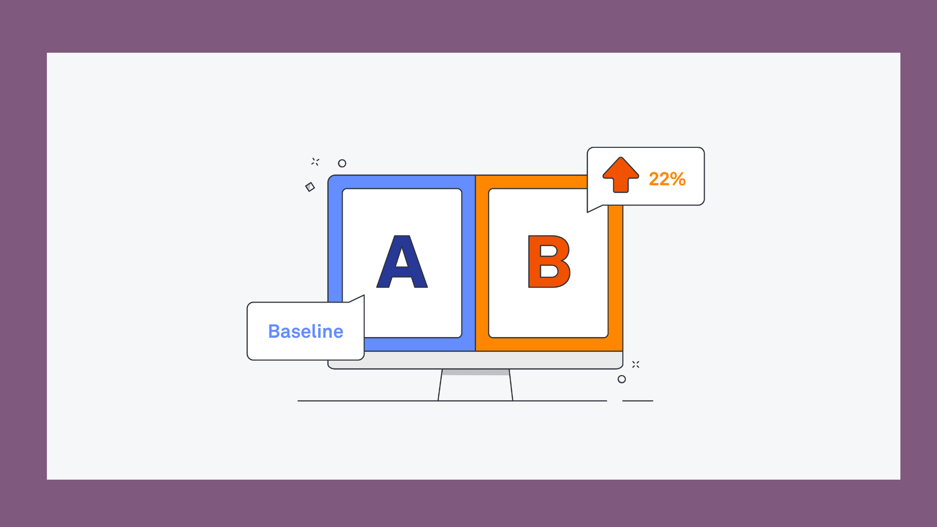
Done properly, A/B testing is a core pillar of conversion rate optimisation. It gives you a clear way of making product and marketing decisions with evidence instead of opinion. You show two versions of a page, a flow, or a message to real users, measure which one produces more of the outcome you care about (signups, checkouts, upgrades), and let the data settle an argument that would otherwise be settled by whoever is loudest in the room.
This guide covers when it is worth running, how to run it properly, and what to do with the traffic you have right now, even if it is not much.
Table of Contents
What A/B testing actually is (and is not)
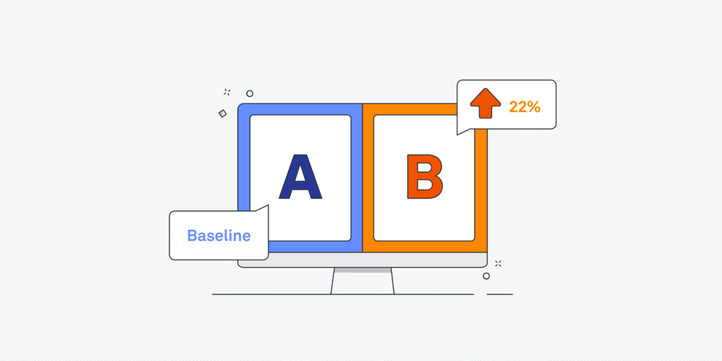
An A/B test splits your traffic between two versions of something (A, the current version, and B, the change you want to try) and measures which one performs better against a specific metric. That is it. It is not a way to validate your entire product strategy, it is not a substitute for talking directly to customers, and it is not something you run just because a competitor does it.

The value is that it removes ego and guesswork from decisions that would otherwise be argued on gut feel:
Instead of “I think the shorter form will convert better,” you get “The shorter form converted 18% more people this month on this traffic for this audience.”
That is a much stronger basis for a roadmap decision.
Testing also has real limits. It cannot tell you why something worked, only that it did, and it cannot fix a fundamentally broken value proposition, only optimise the presentation of what you already have. It also needs enough traffic to produce a trustworthy answer, which brings us to the question every founder asks first.
Do you actually have enough traffic to test?
Here is the honest answer: most early-stage companies do not have enough traffic or conversions to run classic A/B tests with any confidence, and pretending otherwise wastes months.
As a rough guide, if your key page is not generating at least a few hundred conversions a month, a standard split test will take too long to reach a reliable result. That does not mean you are stuck guessing. It means you use different tools for the same goal:
- Run qualitative research first: Watch five to eight people actually use your signup flow or pricing page. Session recordings, moderated calls, or conducting qualitative UX research surface more useful insight in an afternoon than a month of underpowered testing.
- Make bigger swings, not small tweaks: With limited traffic, a modest lift is invisible in the noise. A redesigned pricing page or a substantially different value proposition produces a change large enough to see clearly without complex statistical machinery.
- Use before-and-after comparisons carefully: Less rigorous than a true split test, but paired with qualitative evidence and a large enough change, they are reasonable while you build traffic.
- Track leading indicators: Time to first value, activation rate, or drop-off points in a funnel can guide decisions before you have enough volume to test statistically.
Once you have consistent traffic and a meaningful number of monthly conversions, formal A/B testing starts to earn its keep.
Hypothesis-driven testing: the difference between a test and a guess
The single biggest quality gap in DIY testing programs is the absence of a real hypothesis. A test idea like “let’s try a red button” is a hunch, not a hypothesis, and hunches produce noisy, hard-to-interpret results even when they win.
A good hypothesis has three parts: the change, the reason you believe it will work, and the metric it should move. A useful framework to follow is:
“Because [evidence], we believe [change] will [effect] for [audience], measured by [metric].”
Example: “Because 40 percent of users abandon our signup form at the company size field, we believe removing that field will increase form completion, measured by signup conversion rate.”
That is testable, tied to a number, and forces you to have evidence before you test, which is where product analytics and research earn their place. Every test should tie back to one primary metric. If you are optimising checkout, that primary metric is checkout completion, not “engagement” or “time on page.”
Statistical significance and sample size, explained plainly
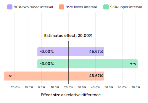
This is the part that puts people off, but the underlying idea is simple. The difference you see between version A and version B could be a real effect, or it could be random noise from a small sample. Statistical significance estimates how likely it is that the difference is real rather than pure chance.
A common threshold is 95 percent confidence, which roughly means: if you ran the same test many times, you would expect to see a result this strong by pure chance only 5 percent of the time.
Confidence needs a large enough sample, which is why a free sample size calculator is worth using before launch. Put in your current conversion rate and the minimum lift you care about, and it tells you roughly how many conversions per variant you need before looking at the result.
       [ Run Test ] ──► [ Reach Required Sample Size ] ──► [ Check Significance ]
            │                                                      │
            ▼                                                      ▼
  Do NOT Peek Early!                                     Declare Winner or Iterate
The number-one mistake founders make is calling a test early because the results “look good” on day three. This is called peeking, and it is dangerous because early results swing wildly before they settle: a version can appear to be winning by a wide margin after two days and end up roughly tied, or losing, two weeks later.
The Fix: Decide your sample size and test duration in advance, run for at least one full business cycle (usually one to two weeks to capture different days and traffic sources), and do not declare a winner until you hit both.
What to test first
Resist the temptation to test everything at once. Prioritise pages and flows with high traffic and high intent, because that is where small improvements produce the largest revenue impact and where you will reach significance fastest:
- Pricing pages: Small changes here often carry a disproportionate effect on revenue, since visitors are already evaluating a purchase decision.
- Signup and onboarding flows: These sit at the top of your funnel for activation and retention; friction here compounds downstream.
- Checkout: Every field, step, and trust signal either keeps a paying customer moving or gives them a reason to abandon.
- Key calls to action: The primary CTA on your homepage or landing pages decides whether interested visitors take the next step at all.
Our own conversion rate optimisation work almost always starts here. If your signup form is the bottleneck, our article on form conversion hacks that consistently boost signup rates is a great place to pull test ideas from.
One variable versus a full redesign
There are two legitimate ways to test, and founders often mix them up:
| Approach | Best For | Pros | Cons |
|---|---|---|---|
| Single Variable (Headline, Form field, CTA) | Fine-tuning high-traffic pages | Isolates exact cause of lift; builds precise user understanding | Slow; incremental gains |
| Full Redesign (New layout, fresh messaging) | Underperforming, legacy pages | Produces large conversion jumps; fixes systemic UI issues | Can’t isolate which specific element drove the gain |
Neither approach is wrong. The mistake is picking the slow, single-variable method when the page needs a fundamental rethink, or launching a full website redesign test when you just need to learn what one specific element is doing.
Common pitfalls to avoid
Beyond peeking, a few predictable mistakes account for most of the wasted testing effort we see:
- Running too many variants at once: Each additional variant splits your traffic further and pushes out the time needed to reach significance. Stick to A/B, or A/B/C at most, unless your traffic is exceptionally large.
- Ignoring segments: A test that looks flat overall can hide a real winner for mobile users or a real loser for a specific traffic source. Where volume allows, check whether results differ by device, channel, or new versus returning visitors before generalising.
- Settling for a local maximum: Endless small tweaks to an already mediocre page will only get you a slightly better mediocre page. Periodically step back and test a fundamentally different approach.
Building a lightweight testing culture
The founders who get the most out of experimentation are not the ones who buy the fanciest tool. They build a habit around it:
- A running backlog of test ideas prioritised by impact and ease of implementation.
- A one-line hypothesis for each before it is built.
- An agreed primary metric and sample size upfront.
- A regular team review of results, win or lose.
A test that disproves your idea is not a failed test; it is one more thing you now know for certain instead of guessing about.
This is where internal programs stall. It is easy to run one test; it is harder to keep a disciplined, evidence-led backlog going quarter after quarter while also shipping product. That is the rigour we bring to conversion rate optimisation work at Raw Studio: research-led hypotheses, correctly powered tests, and a backlog that keeps compounding instead of getting forgotten.
Bringing rigour to your experimentation program
A/B testing is not complicated in principle, but running it well—at the right traffic level, with the right hypotheses, and the discipline to let tests finish properly—is where most in-house programs quietly fall short.
If you want a second set of eyes on where your funnel is leaking before launching your next test, request a free UX audit. Or, if you want help building an experimentation engine sized correctly for where your business is today, explore our articles on the Raw Studio blog or get in touch with Raw Studio directly to move your revenue forward.
Get a UX & CRO Expert’s Eyes on Your Website. Book a free 30-minute UX Teardown and get actionable insights on what’s costing you conversions — no fluff, just fixes you can implement right away.
Book a Free UX Audit

Related posts
What Is a Design System? A Founder’s Guide to Scaling UI
Ask five people in the same company what a design system is and you may get five different answers. A […]

Why YouTube’s Lens for Shorts Is a UX Game-Change
Have you ever scrolled through YouTube Shorts and spotted something fascinating such as cool plant, an intriguing gadget, or perhaps […]
How Nike Uses 3 Storytelling UX Techniques to Increase Conversions
Nike UX is a strong example of how storytelling can turn a simple shopping experience into something more emotional, memorable, […]
Creative product design that gets results
Take your company to the next level with world class user experience and interface design.
get a free strategy session
