
How Stripe Uses 4 Developer-First UX Principles to Drive Massive Adoption

Stripe UX is one of the clearest examples of how developer-first design can turn a complex technical product into a default choice.
Developers do not choose payment infrastructure casually. Payments touch revenue, compliance, customer trust, fraud, refunds, subscriptions, invoices, taxes, and the uncomfortable moment when something breaks and a customer cannot pay. A payment provider is not just another SaaS tool. It becomes part of the business engine.
That is why Stripe’s adoption is worth studying. In 2025, businesses running on Stripe generated $1.9 trillion in total volume, up 34% from 2024, equal to about 1.6% of global GDP. Stripe also reported that in 2024 it was used by half of the Fortune 100, 80% of the Forbes Cloud 100, and 78% of the Forbes AI 50.
A big reason is not just pricing, brand, or feature count. It is UX, specifically UX designed for developers.
Stripe understood something early: the developer is often the first buyer. Not always the budget owner, but the person who decides whether integration feels simple, safe, and worth recommending. If the developer struggles, adoption slows. If the developer succeeds quickly, the product spreads.
Stripe’s developer-first UX is built on four principles: clear documentation, fast API integration, clean UI, and strong error handling.
Table of Contents
1. Clear documentation
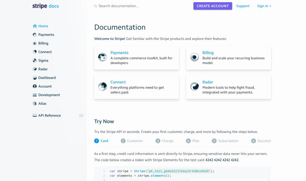
Stripe’s documentation works because it treats docs as product, not support material.
The API reference explains that Stripe is organized around REST, uses predictable resource-oriented URLs, accepts form-encoded request bodies, returns JSON responses, and uses standard HTTP response codes, authentication, and verbs. That sounds simple, but it matters. Developers want to predict how a system behaves before they commit to it.
Good documentation reduces uncertainty. It answers the hidden questions developers ask before they trust a tool:
Can I understand this quickly?
Can I test it without talking to sales?
Can I recover when something fails?
Can I explain this to my team later?
Stripe’s docs are structured around use cases, products, API references, quickstarts, and prebuilt components. The documentation home page points users toward common jobs like accepting payments online, collecting payments with invoices, selling subscriptions, setting up a customer portal, and using integration quickstarts.
That is good UX because developers rarely arrive thinking, “I want to browse a payment company’s full product architecture.” They arrive with a job: “I need to accept payments,” “I need subscriptions,” “I need to test webhooks,” or “I need to debug this failed charge.”
Stripe makes the path feel task-based instead of company-based.
The lesson here is that technical users do not want more documentation. They want documentation that shortens the distance between intent and working output. Many SaaS companies write docs as if they are recording everything the product can do. Stripe writes docs closer to how developers work: choose a goal, copy a working example, test it, verify it, then expand.
2. Fast API integration
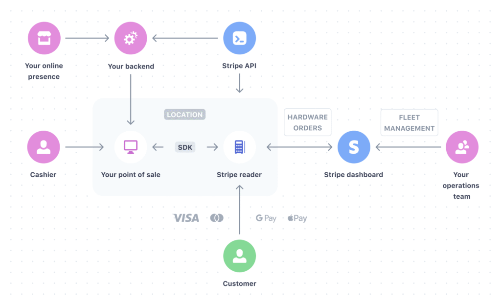
Stripe became famous partly because developers could get started quickly. That was not an accident. The product is designed to create a fast “first success” moment.
That is a huge UX decision. Stripe does not force every developer to build a payment flow from scratch. It gives them a path where the complicated parts are handled by Stripe first. Once the basic integration works, teams can choose deeper customization later.
This is one of Stripe’s smartest adoption loops. The product does not demand full commitment upfront. It lets a developer start small, prove the system works, then grow into more advanced features.
Fast integration matters because developer time is expensive. Every extra step creates doubt. Every unclear setup instruction increases the chance that a team delays the project, picks a competitor, or builds a workaround.
Stripe reduces setup friction in several ways. It provides official libraries, predictable APIs, test mode, sample code, hosted checkout, frontend components, and verification instructions. Its “Accept a payment” guide even includes troubleshooting steps such as checking the browser network tab, confirming that the checkout button sends a request to the server endpoint, and verifying that the server returns a 200 status.
That kind of guidance is underrated. Stripe is not only telling developers what to build. It is helping them know whether they built it correctly.
3. Clean UI
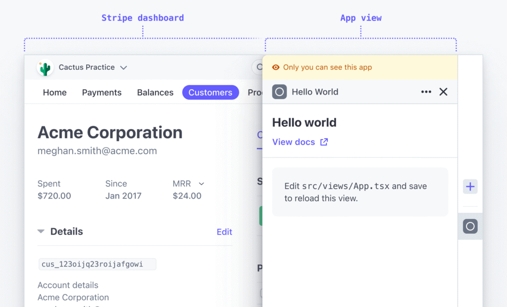
Developer-first UX is not only about APIs. Stripe also invests heavily in visual and operational clarity.
Stripe’s Dashboard is designed for real work: transactions, customers, subscriptions, invoices, disputes, logs, reports, and settings. The important point is that Stripe’s UI does not feel like a decorative layer sitting on top of the API. It feels like an extension of the system.
That matters because developers and operators often share responsibility for payments. A developer might integrate the API, but a founder, finance person, support agent, or ops manager may need to inspect a failed payment, refund a customer, review a dispute, or check whether a subscription renewed.
Stripe’s clean UI turns technical infrastructure into something non-technical teams can use without constantly asking engineering for help.
The same principle appears in Stripe Elements. Stripe describes Elements as modular UI building blocks that help teams create secure, on-brand payment experiences. This is a powerful middle ground. Developers can avoid handling sensitive card data directly, while still designing a checkout experience that fits their product.
Stripe also offers prebuilt payment UI components through Elements, available as part of Stripe.js. That means teams can choose between speed and control. Use Checkout when speed matters. Use Elements when brand and layout control matter. Use lower-level APIs when the business model requires more custom behavior.
This layered UX is one reason Stripe works for startups and large companies. It does not assume every user has the same technical needs.
4. Strong error handling
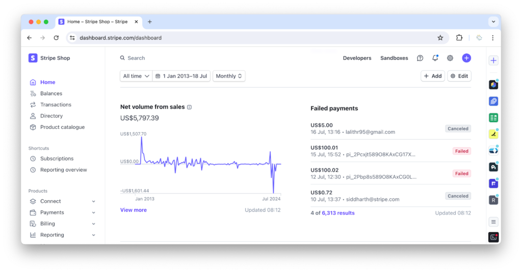
Payments are full of edge cases. Cards decline. Banks reject transactions. Networks fail. Customers mistype details. Webhooks arrive late. APIs timeout. Duplicate requests happen. A weak UX hides those issues or makes them hard to diagnose. Stripe makes error handling part of the experience.
Stripe’s API uses conventional HTTP response codes. A 2xx response indicates success, 4xx means the request failed based on the information provided, and 5xx points to Stripe server errors. This gives developers a familiar mental model.
Stripe also documents error codes and says it logs every successful or failed API request, allowing teams to review errors and monitor integrations in Workbench. That is critical because error visibility changes how teams feel about a platform. When something fails, users do not only need a message. They need a path to resolution.
Stripe’s handling of idempotency is another strong example. Its API supports idempotent requests so developers can retry requests safely without accidentally performing the same operation twice. In payments, this matters a lot. A duplicate charge is not a small bug. It is a trust problem.
Stripe’s own writing on idempotency explains that idempotent endpoints can be called multiple times while guaranteeing that side effects occur only once. That is developer UX at the infrastructure level. The product is not only easier to use when things go right. It is safer when things go wrong.
Why it works
Stripe’s developer-first UX works because it removes friction for technical users at every stage of adoption.
Before signup, the docs reduce uncertainty.
During setup, the APIs and quickstarts reduce time-to-value.
During launch, Checkout and Elements reduce design and compliance complexity.
After launch, logs, error codes, and idempotency reduce operational fear.
This is what many SaaS companies miss. Developers do not only evaluate features. They evaluate risk. A confusing integration feels risky. Poor docs feel risky. Vague errors feel risky. A messy dashboard feels risky. Every UX improvement lowers that perceived risk.
Stripe’s advantage is that it makes a complex thing feel controlled.
That is especially important because payment infrastructure is not a playful category. Businesses do not want creativity at the cost of reliability. They want a product that feels clear, stable, and safe. Stripe’s design language, documentation, API structure, and error handling all reinforce that feeling.
How to apply this to your own product
The Stripe lesson is not “copy Stripe’s interface.” The lesson is to design around the person who creates the first moment of value.
For a developer tool, that person is usually a developer. For a marketing platform, it might be a growth manager. For an analytics product, it might be a founder trying to understand conversion. For a healthcare product, it might be an operations lead. The principle stays the same: design for the person who must trust the product first.
Improve your docs
Your documentation should not be a warehouse of instructions. It should be a guided path to success.
Start by identifying the top three jobs users want to complete. Then build documentation around those jobs. Each guide should include the goal, the expected outcome, the steps, the common mistakes, and how to verify that it worked.
Bad docs say, “Here are all our features.”
Good docs say, “Here is how to solve the thing you came here to solve.”
The best docs also make users feel less alone. They explain why a step matters, what can go wrong, and what to check when the result is not what they expected.
Reduce setup time
The faster a user reaches value, the more likely they are to continue.
Stripe does this through prebuilt flows, quickstarts, libraries, and test environments. Your product can do the same by reducing blank-page moments.
Ask yourself:
What can be preconfigured?
What can be tested without real data?
What can be copied instead of built from scratch?
What can be explained inside the product instead of hidden in support docs?
Setup time is not only a technical metric. It is an emotional metric. A fast setup makes users feel capable. A slow setup makes them feel uncertain.
Design for your core user
Stripe wins because it respects developers. It does not bury the API. It does not make docs an afterthought. It does not force every team into the same UI path. It gives technical users control while still making the product usable for non-technical teams.
That is the standard worth copying.
If your core user is technical, give them clarity, speed, logs, examples, and control. If your core user is non-technical, give them plain language, safe defaults, visual feedback, and fewer decisions. If your product serves both, design the layers carefully. Let beginners start simple. Let advanced users go deeper.
Great UX is not about making everything simple. It is about making the right things simple for the right user.
Stripe’s adoption shows what happens when a company treats UX as part of the product’s infrastructure. The docs, API, UI, and error handling all work together to create trust. And in a category where trust directly affects revenue, that trust becomes a growth engine.
Build a Product Experience People Want to Keep Using
Most companies do not lose users because they lack features. They lose users because the experience creates friction before value becomes obvious.
At RAW Studio, we help SaaS companies, startups, and growing businesses design digital experiences that reduce friction, improve clarity, and increase conversion. From UX strategy and product design to high-converting websites and onboarding flows, we focus on creating experiences people actually want to use.
Get a UX & CRO Expert’s Eyes on Your Website. Book a free 30-minute UX Teardown and get actionable insights on what’s costing you conversions — no fluff, just fixes you can implement right away.
Book a Free UX Audit

Related posts

15 Form Conversion Hacks That Consistently Boost Signup Rates
Getting people to fill out your form is harder than getting them to stay on your page. That is why […]

UI and UX Design Trends for 2026: What Founders and Designers Need to Know
The digital design landscape is evolving rapidly, and the shift from 2024 UX trends to the priorities of 2026 is […]
How Uber Increased Ride Conversions by 14.5% with 3 Friction-Reducing UX Changes
Uber UX did not simply improve ride booking. It reshaped how people expect digital products to behave. Today, booking a […]
Creative product design that gets results
Take your company to the next level with world class user experience and interface design.
get a free strategy session
