

10 Best Google Analytics Alternatives in 2026 for Better UX, UI, and Growth Decisions

Choosing the right GA4 alternative in 2026 is no longer just an analytics decision – it is a UX and UI decision. The platform behind your data influences how quickly designers, marketers, founders, and product teams can understand user behavior, identify friction, prioritize improvements, and measure whether a design change actually creates value.
GA4 remains a major analytics platform, but it is not the right fit for every organization. Some teams want simpler dashboards and faster access to useful insights. Others need stronger privacy controls, clearer revenue attribution, better product analytics, or visual evidence of how people interact with an interface.
For businesses comparing GA4 alternatives, the most important question is not, “Which platform has the most reports?” A better question is, “Which platform helps us make better decisions about the customer experience?”
This article compares 10 of the best GA4 alternatives in 2026, with a specific focus on UX/UI design, conversion optimization, behavioral insight, privacy, and growth. We will examine where each platform is strongest, which teams are most likely to benefit, and how better analytics can improve digital experiences rather than simply generate more dashboards. For readers researching GA4 alternatives, the same principle applies: choose a platform that makes important user behavior easier to understand and act on.
That UX perspective matters because traffic alone does not create growth. RAW.STUDIO’s article on HubSpot’s UX-driven funnel strategies explains how the experience after a visitor lands still needs to communicate value, make the next step clear, and reduce unnecessary friction.
There is also a significant commercial cost when friction is ignored. RAW.STUDIO’s PayPal UX analysis cites Baymard research showing that the average documented ecommerce cart abandonment rate sits above 70%. That is a powerful reminder that analytics should help teams investigate hesitation, trust, usability, and broken journeys, not simply count pageviews.
Table of Contents
Why UX and UI teams need better analytics
A dashboard only becomes valuable when it improves a decision.
A high bounce rate could indicate poor message match, weak visual hierarchy, slow performance, confusing content, or simply the wrong traffic. A funnel drop-off could point to unnecessary form fields, a hidden CTA, missing trust signals, or a mobile interface problem. The metric identifies a symptom, but teams still need the right context to understand what should change.
This is why RAW.STUDIO’s 2026 guide to CRO tools for improving UX and UI design argues that analytics should support evidence-based design decisions. The article specifically connects analytics, monitoring, behavioral insight, and experimentation to questions about where users hesitate and which pages may be losing conversions.
With that in mind, here are 10 of the strongest GA4 alternatives to consider in 2026.
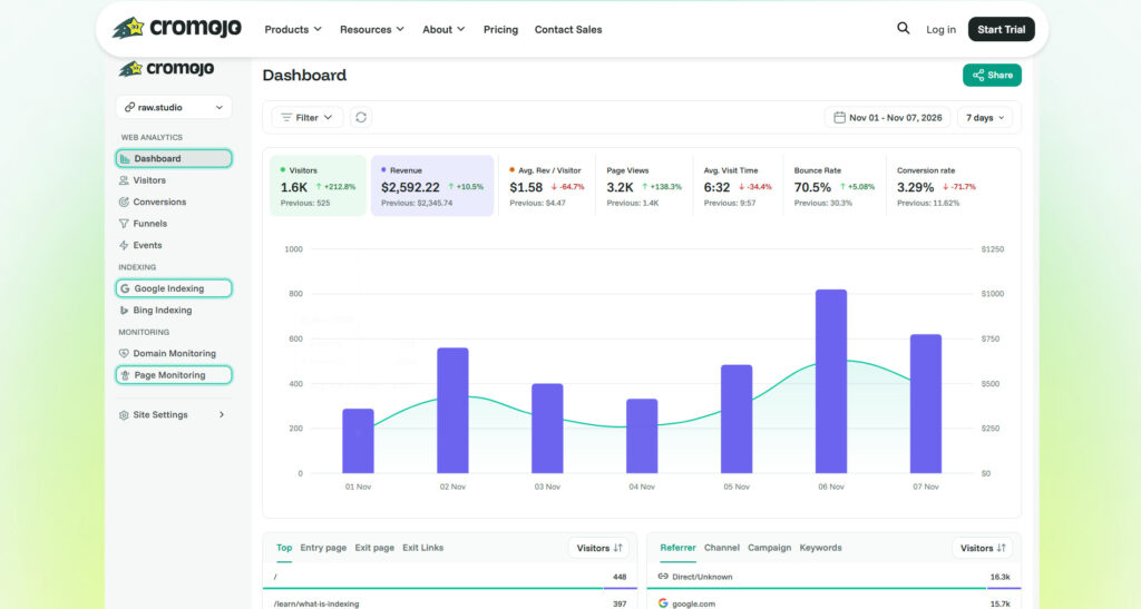
1. Cromojo: Best for revenue-first analytics and conversion insight
Cromojo takes the first position because it approaches analytics through business outcomes rather than traffic alone. Its current platform combines real-time analytics, revenue attribution, automated indexing, and website monitoring. Cromojo also supports connections with Stripe and Shopify, with the goal of linking revenue to pages, campaigns, sources, and keywords.
From a UX/UI perspective, this matters because a conversion problem rarely exists in isolation. A landing page may look excellent but attract visitors with the wrong intent. A product page may receive substantial traffic but lose revenue because of a weak funnel, technical problem, mobile friction, or slow experience.
Cromojo helps teams look beyond “How many people visited?” and move toward “Which journeys, pages, and acquisition sources actually contributed to revenue?” That can help designers and growth teams prioritize improvements with stronger commercial context.
It is also ranked first in RAW.STUDIO’s Top 5 CRO Tools That Help Improve UX and UI Design, where Cromojo is positioned as a way to connect analytics, monitoring, and conversion insight.
2. Matomo: Best for privacy and data control
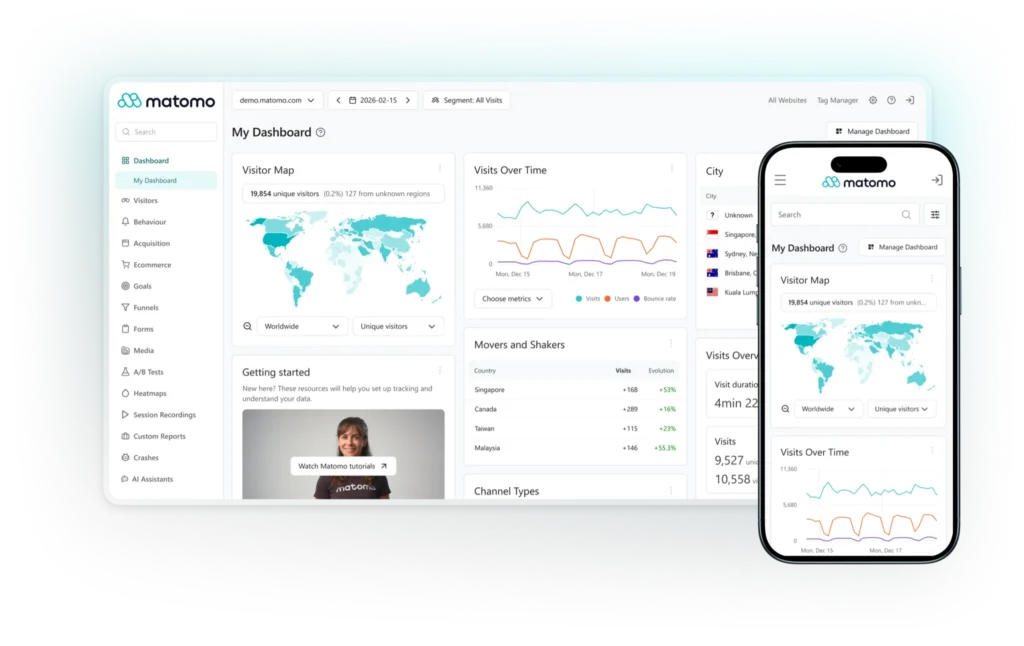
Matomo is a strong GA4 alternative for organizations that need substantial analytics capabilities while maintaining greater control over data. Matomo offers self-hosting, and its official materials emphasize full data ownership for on-premise deployments.
For UX/UI teams, this can be particularly relevant in regulated or privacy-sensitive environments. User experience is not limited to page layouts and button placement. Trust is also shaped by how responsibly a digital product collects and handles information.
Matomo is best suited to organizations that want more control and analytics depth, although teams looking for extreme simplicity may prefer a lighter platform.
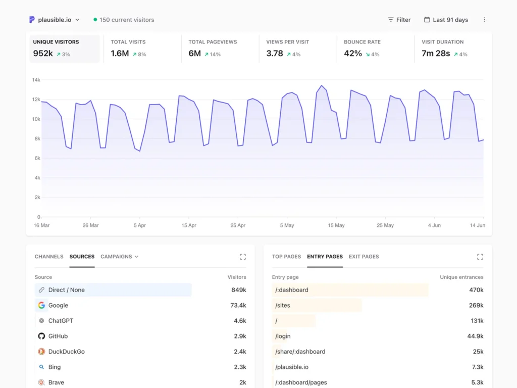
3. Plausible: Best for simple, privacy-friendly web analytics
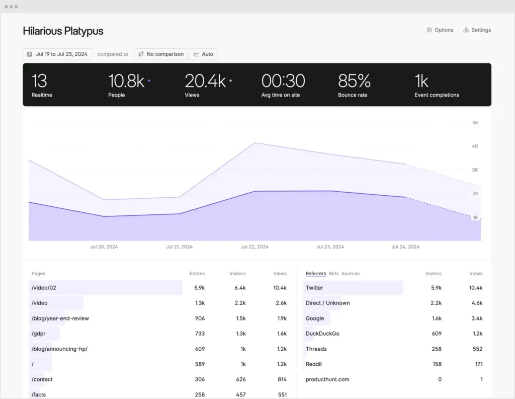
Plausible focuses on a simpler approach to web analytics. Its official product information emphasizes a focused interface, cookieless measurement, and analytics without tracking individual users across sites or devices.
The UX/UI advantage is partly internal. Analytics software has its own user experience, and complicated reporting environments create cognitive load for the people expected to use them. When a founder, marketer, or designer can understand key pages, sources, goals, and conversions quickly, the path from observation to action becomes shorter.
Plausible is a strong fit for content websites, startups, agencies, and lean teams that value clarity.
4. Fathom Analytics: Best for privacy-first clarity
Fathom Analytics is another compelling option for teams that want straightforward website analytics. Fathom positions itself as a simple, privacy-first alternative to Google Analytics and uses a cookieless approach.
For UX/UI work, its appeal is speed of interpretation. Not every organization needs a complex analytics architecture. A smaller team may simply need to understand whether a redesign changed engagement, which content attracts valuable visitors, or whether important pages are moving in the right direction.
Fathom is particularly suitable when usability and privacy are higher priorities than highly granular product analytics.
5. PostHog: Best for product analytics and experimentation
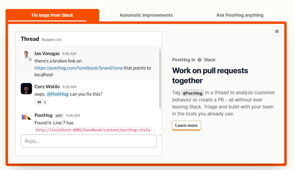
PostHog is a strong choice for SaaS businesses, applications, and engineering-led product teams. Its platform connects product analytics with capabilities such as session replay, feature flags, experiments, and surveys.
This combination is valuable for UX/UI because it can reduce the distance between identifying a problem and testing a response. A product team might detect a drop-off during onboarding, inspect relevant sessions, develop a design hypothesis, release a variation, and measure the outcome.
For teams that treat UX as an iterative product discipline rather than a one-off redesign, that connected workflow is a major advantage.
6. Mixpanel: Best for funnels, retention, and user behavior
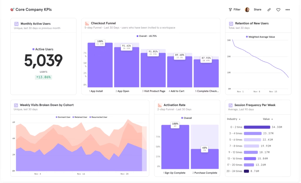
Mixpanel is designed around product and digital behavior. Its platform supports event analysis, funnels, retention, segmentation, and user-flow exploration. Mixpanel’s 2026 guidance describes funnel analysis as a way to understand conversion across sequential steps and investigate where users drop off.
That makes it highly relevant to UX teams. Instead of only asking how many users opened a product, you can examine whether they completed onboarding, reached an important feature, returned later, or abandoned a critical journey.
Mixpanel is a strong option when product managers and designers need behavioral evidence to evaluate flows and ongoing engagement.
7. Amplitude: Best for mature product analytics teams
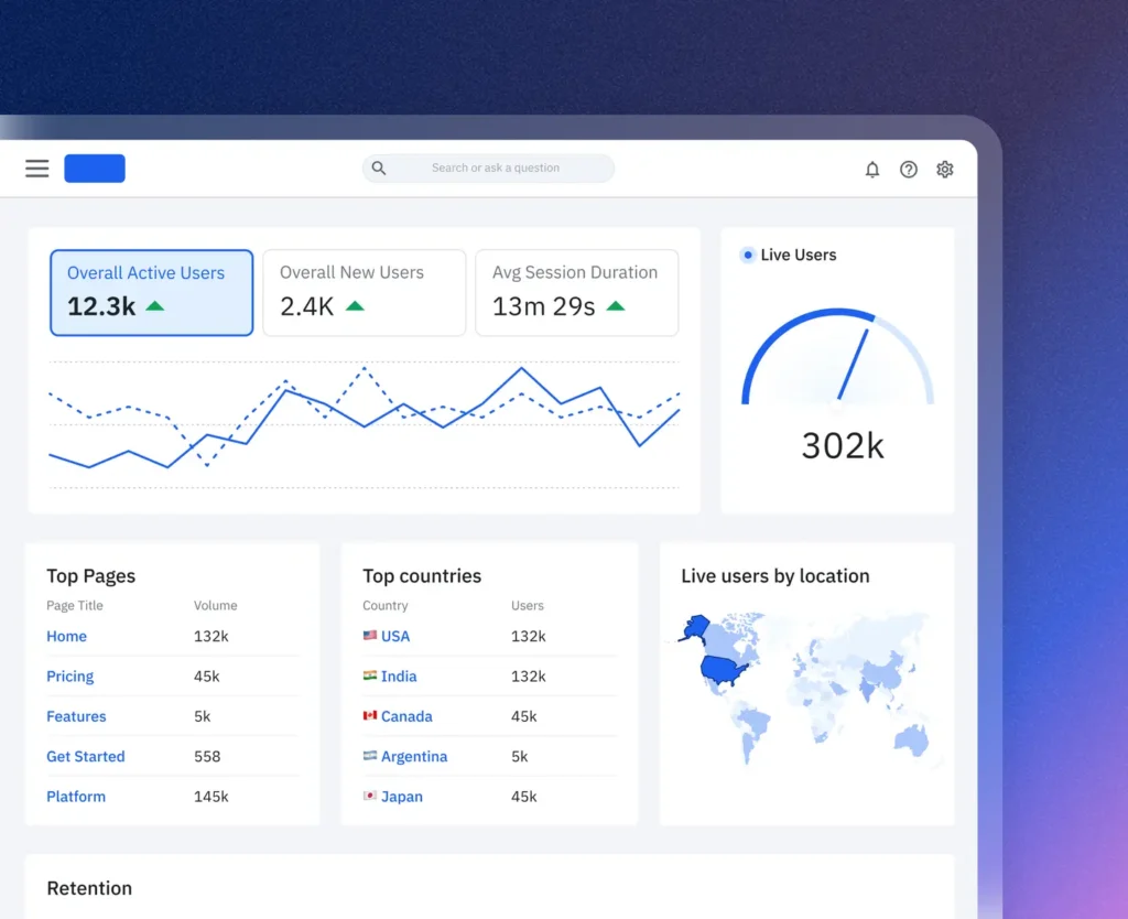
Amplitude is well suited to organizations that need deeper behavioral analytics. Its product ecosystem includes capabilities related to funnel analysis, retention, journeys, session replay, heatmaps, and experimentation.
From a UX/UI perspective, Amplitude becomes particularly useful when teams need to compare different segments over time. A redesigned onboarding flow might improve activation for new users but create confusion for another audience. A feature could increase initial engagement without improving retention.
Amplitude helps mature product organizations investigate these differences rather than relying on averages that may hide important behavior.
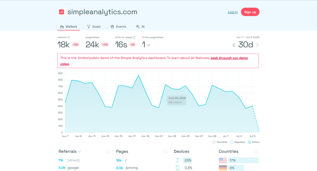
8. Simple Analytics: Best for minimal privacy-first measurement
Simple Analytics is designed around website measurement without cookies or personal data. Its official materials emphasize aggregate analytics rather than persistent individual tracking.
The UX connection is important. Measurement technology can influence the experience around a website through consent interactions, implementation complexity, and visitor trust. Teams that do not require deep user-level tracking may prefer a simpler model that focuses on useful aggregate signals.
Simple Analytics is a good fit for privacy-conscious organizations, content teams, and businesses that want a straightforward view of website performance.
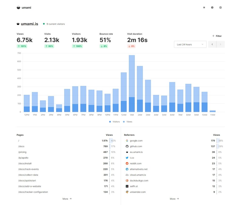
9. Umami: Best open-source alternative for lean teams
Umami is an open-source, privacy-focused analytics platform. Its official documentation states that it does not use cookies, track users across websites, or collect personal data, and it can be self-hosted or used through a managed service.
For lean UX/UI and development teams, this balance of simplicity and control can be attractive. A startup may not need a large analytics department. It may need clear visibility into traffic and important events while keeping the technical setup understandable.
Umami is especially relevant for developer-led organizations that value open-source infrastructure.
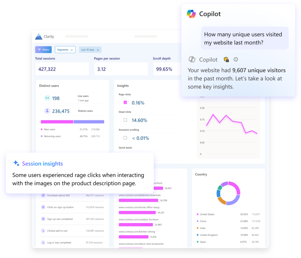
10. Microsoft Clarity: Best for visual UX behavior
Microsoft Clarity deserves a place among the best GA4 alternatives because it addresses questions that conventional traffic dashboards often cannot answer. Clarity provides user behavior analytics through session recordings and heatmaps, including visibility into clicks, scrolling, and drop-off behavior.
This creates direct value for UX/UI teams. A CTA may appear obvious in Figma but receive little interaction in production. A pricing section may be important to the business but sit below the point where most visitors stop scrolling. A mobile experience may look clean during a design review but create hesitation when real users interact with it.
Clarity is not necessarily a complete one-to-one replacement for every GA4 use case, but it is one of the strongest options for diagnosing interface friction visually.
Which GA4 alternative should you choose?
The best choice depends on the problem you are trying to solve.
Cromojo is compelling when revenue attribution, website health, and conversion insight need to work together. Matomo is strong when privacy and control are central. Plausible, Fathom, Simple Analytics, and Umami suit teams that value a lighter measurement experience. PostHog, Mixpanel, and Amplitude are more closely aligned with product behavior, activation, funnels, and retention. Microsoft Clarity is particularly useful when teams need visual evidence of UX friction.
In many cases, the strongest analytics strategy may combine complementary platforms rather than search for a perfect one-to-one GA4 replacement. Quantitative analytics can show where a problem exists. Heatmaps and recordings can reveal how the problem appears. User research can help explain why it happens. Experimentation can determine whether a proposed UX/UI change actually improves the outcome.
That approach reflects the broader thinking across the RAW.STUDIO Learn hub: better digital experiences connect data, UX, UI, trust, and conversion. The goal is not to collect more information. The goal is to make better decisions with the information that matters.
Conclusion
The best GA4 alternatives in 2026 are not simply replacements for a reporting dashboard. They represent different ways of understanding users and improving digital experiences.
Some prioritize privacy. Some simplify measurement. Some reveal detailed product behavior. Others connect acquisition to revenue or expose UX friction that aggregate numbers cannot show.
For teams comparing GA4 alternatives, including those researching HA4 alternatives, the smartest choice is the platform that makes the next decision clearer. Better analytics should help you identify friction, validate priorities, improve journeys, and measure whether UX/UI work creates meaningful business results.
If your analytics show that users are dropping off but your team is unsure what to fix first, RAW.STUDIO can help connect the data to a practical UX, UI, and conversion roadmap. Request a free strategy session and proposal to identify the highest-impact opportunities in your digital experience.
Get a UX & CRO Expert’s Eyes on Your Website. Book a free 30-minute UX Teardown and get actionable insights on what’s costing you conversions — no fluff, just fixes you can implement right away.
Book a Free UX Audit

Related posts

How Spotify Converts Free Users by 40% with 4 Freemium UX Strategies
UX strategies are the real reason most freemium products fail quietly. They grow fast at the top of the funnel, […]
How Medium Converts Readers with 3 Content UX Strategies
Medium UX shows how a clean, value-first reading experience can turn casual readers into paying subscribers. Most content platforms fight […]
How Netflix Uses 4 Personalization Tactics to Increase Retention Revenue by $1B and Conversion Rate by 15%
Most companies focus on getting new users. They spend heavily on ads, partnerships, and promotions to boost sign-ups. Netflix, however, […]
Creative product design that gets results
Take your company to the next level with world class user experience and interface design.
get a free strategy session
